


Monument Signs South Africa: Low-Profile Entry Guide
Most estate and campus entrances are judged in the few seconds it takes a car to slow at the gate. A monument sign South Africa property managers commission has to do two jobs in that window: name the place clearly and signal that the site is well run. Too many developers still default to a tall pylon that competes with power lines and tree lines, or a plain plaque that disappears behind a hedge. Low-profile, high-impact entry signage sits between those extremes, and getting it right takes more planning than the drawing suggests.
Table of Contents
- Quick Takeaways
- What a Monument Sign Actually Has to Do
- Low-Profile Does Not Mean Low Visibility
- Materials and Finishes for Gauteng Conditions
- Campus and Office Park Wayfinding
- Keeping Corporate Identity Consistent Across Sites
- Estate Rules, Body Corporates and Municipal Approval
- Monument, Pylon or Fascia: Choosing the Right Format
- Renting Entry Signage for Temporary Sites and Events
- Frequently Asked Questions
- References
Quick Takeaways
| Key Insight | Explanation |
|---|---|
| Test from the driver's seat | Check the sign's visibility from the exact stopping point at the gate, not from the pavement where the drawing was made. |
| Lighting decides the night | Plan illumination from the first design meeting. A sign that only works in daylight fails for much of the time an estate or campus entrance is actually used. |
| Write the brand rules down | Franchise and corporate sites need a sign standards document covering fonts, colours, mounting heights and spacing before the first installation. |
| Specify materials for the Highveld | Choose finishes that handle strong sun, summer storms and dust. Avoid cheap plastics on any part that takes weather or contact. |
| Approvals set the timeline | Estate design committees and municipal sign applications often take longer than fabrication. Start them before you sign off a quote. |
| Pick the format for the job | Monument, pylon and fascia signs solve different problems. Choose by what the entrance must do, not by what looks biggest on a render. |
What a Monument Sign Actually Has to Do
A monument sign is a freestanding, ground-mounted sign with a solid base, usually built from masonry, rendered block or a clad steel frame. It sits close to the ground and carries the name of the place, often with a logo and a short line of direction. The defining feature is that it reads as architecture as much as advertising.
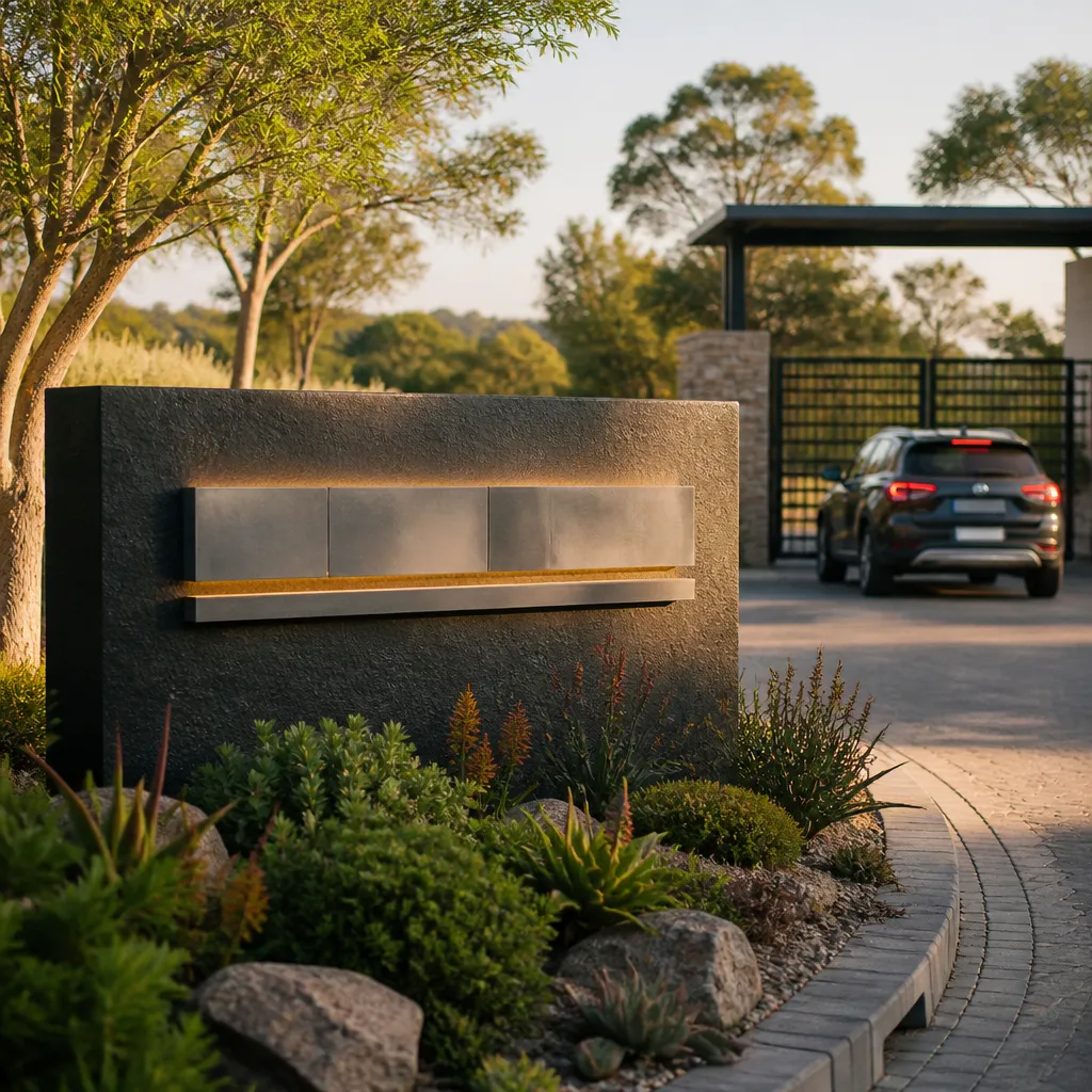
In practice, an estate or campus entrance needs the sign to do three things in a few seconds: identify the place, confirm you are at the right entrance, and signal that the site is managed. A monument sign handles all three without the height that brings a pylon into conflict with trees, overhead cables or a neighbouring property's view. We treat the base as part of the design, because it is the element that gets bumped by a reversing bakkie and the first thing people touch when they stop.
A common mistake is treating the monument as a box with a panel on top. Good ones are designed as small landscape features. The plinth sits on a level bed, the lettering is set back far enough to avoid glare, and the planting is specified as part of the job. If the landscaper arrives after the sign is installed, the result is usually a bare concrete base sitting in gravel.
The entrance sign is often the only piece of signage a visitor reads twice, so it should be the easiest thing on the site to understand.
Pro tip: Ask the landscaper, the sign fabricator and the estate's building manager to sign off one combined drawing. Three separate drawings almost always produce a clash between the plinth height and the planting bed.
Low-Profile Does Not Mean Low Visibility
The biggest misunderstanding we hear from property managers is that a low sign will be hard to find. It will be hard to find only if it is designed for the wrong viewer. A monument sign has to work for a driver approaching at walking pace, a delivery driver checking an address on a phone, and a visitor who has already passed the entrance once.
Sightlines from the driver's seat
Set up a site visit at the exact point where a vehicle stops at the boom or gate, then look at the proposed position from that seat height. Trees, boundary walls, parked cars and the curve of the approach road all affect what the driver actually sees. A sign that is clear from the pavement can be hidden by a hedge that was planted after the drawings were approved.
The fix is usually small. Moving the sign a few metres along the approach, or changing the lettering height so the name reads across the full width of the panel, solves most problems. Do this test before the foundation is poured, because moving a plinth after installation costs far more than a short walk with a tape measure.
Lighting that works after dark
Many estates and campuses use their entrances most in the early morning and the evening, which means the sign is judged in low light. Internally illuminated panels, LED strip lighting behind a routed acrylic face and downlighting from a nearby post all work, but each creates a different look. Halo lighting gives a premium feel but needs careful positioning so it does not glare into the driver's eyes.
Specify the lighting circuit and the photocell or timer early, and check whether the estate's electrical contractor or the site's existing supply can carry the load. A dark sign at night is the fastest way to make a well-funded entrance look neglected.
Materials and Finishes for Gauteng Conditions
Gauteng gives signs a hard time. The Highveld brings strong UV in summer, sudden storms, hail in some seasons and a constant layer of dust that settles into every recess. A material that looks excellent in a showroom can fade, warp or streak within a few years if it was chosen for looks alone.
Bases and plinths
The base takes the most knocks, from splash, grit, vehicle contact and irrigation spray. Rendered masonry with a proper sealer, or a clad steel frame with powder-coated finish, works well. Avoid thin decorative cladding that is fixed with adhesive only, because it tends to lift at the joints after a few seasons of heat and rain.
Drainage matters too. Water sitting at the base of a sign will wick into the panel fixings and stain the finish. We usually recommend a small drip gap or a sloped top on the plinth, even when the design is otherwise flat.
Panels and lettering
For the sign face, aluminium composite panels give a flat, premium finish that holds its shape well in heat. Routed acrylic letters with a second-surface print are a strong option for lit signs. Vinyl lettering is cheaper and quick to replace, but it fades faster in full sun, so specify a UV-rated film and plan a replacement cycle in the maintenance budget.
Pro tip: Order a sample panel and leave it outside, facing the main sun direction, for at least two weeks before the final colour is approved. Colour charts are printed under controlled lighting and rarely match what a Highveld afternoon does to a finish.
Campus and Office Park Wayfinding
A campus or office park has a different problem from a residential estate. Visitors arrive at one main gate, then need to find one of several buildings, car parks or reception areas. The entrance monument has to name the park clearly, while smaller directional signs take over once the visitor is inside.
In practice, the monument should carry the park name and perhaps one or two major tenants or landmarks. Anything more turns the sign into a directory, which is harder to read at speed. Internal wayfinding is better handled by a separate set of smaller signs placed at decision points, such as junctions and car park entrances.
Layering the entrance with a building directory
Where a site has several buildings, a second, smaller directory panel near the first car park works well. Keep both in the same visual family, using the same typeface, colour and mounting style, so the visitor feels they are reading one system. Two competing styles make a campus feel like a set of separate developments that happen to share an address.
Naming conventions for multi-building sites
Building names on a campus should be fixed before fabrication, and they should match what appears in email signatures, lease documents and the navigation apps that people use. A sign that says Block C when the mapping app says Tower Three creates confusion on the first visit. We ask the client to confirm the naming list in writing and keep it in the sign standards file.
Keeping Corporate Identity Consistent Across Sites
Corporate and franchise clients usually have a brand manual, but it rarely covers entrance signage in enough detail. The result is that the head office entrance looks polished while a regional campus uses an older logo, a different blue and a font nobody approved. Consistency is not cosmetic. Visitors and employees read it as a sign of how the business is run.
Writing a sign standards manual
A useful sign standards document is short and specific. It should cover the approved logo versions, colour references for the specific material being used, minimum letter heights for each viewing distance, mounting heights, clearance from walls and paths, and the approved lighting method. A page with clear diagrams beats a fifty-page brand book that nobody opens.
Approving the first installation as the master
The first monument installed should be treated as the master reference for every later site. Photograph it in daylight and at night, record the exact dimensions and materials, and store the fabrication drawings with the approved finishes. When a franchisee asks for a variation, the master gives you a fixed point to measure against.
Estate Rules, Body Corporates and Municipal Approval
Entrance signage is rarely a decision for one person. An estate may have a design committee or a body corporate with rules on height, materials and illumination. A campus may have a landlord, a facilities team and a head office brand group. Each one can hold up the project if it is brought in late.
Estate design and aesthetic committees
Estate committees tend to care most about how the sign fits the streetscape and whether it looks like advertising. Bring a simple elevation, a site plan showing the position relative to the boom and boundary wall, and a photo montage of the sign in place. Committees approve what they can picture, so a render taken from the actual gate is far more persuasive than a generic illustration.
Municipal applications and structural sign-off
Depending on the size, height and whether the sign is illuminated, a municipal application or building plan submission may be needed. Requirements vary by municipality, so confirm them with the local building and planning office before fixing a installation date. Where the base or the sign is large enough to need structural input, get the engineer's sign-off on the foundation before the concrete is poured.
Pro tip: Ask the estate manager to confirm in writing which approvals apply and in what order. Verbal assurances that the committee has no objection rarely survive a change of committee members.
Monument, Pylon or Fascia: Choosing the Right Format
Monument signs are not always the right answer. A busy roadside site with a long setback may need a pylon to be seen from a distance. A building with a strong facade may suit a fascia sign better than any freestanding option. The right choice depends on how the entrance is approached, how far away the viewer is at the point of decision, and what the site is trying to communicate.

The table below compares the three formats we see most often on estates, campuses and office parks in Gauteng. Use it as a starting point, then test your shortlist against the sightline and approval checks described earlier.
| Format | Best fit | Main trade-off |
|---|---|---|
| Monument sign | Estate gates, campus entrances and office parks where the approach is slow and the setting is landscaped | Needs a clear, level site and a planting plan. Less visible from a fast road or a long distance. |
| Pylon sign | Roadside sites with a long setback, retail parks and sites needing visibility from passing traffic | Height brings planning, cable and tree clearance issues. Can feel out of place in a residential or heritage setting. |
| Fascia or wall sign | Single buildings with a strong facade, or sites where a freestanding structure is not permitted | Ties the sign to the building. Gives no presence at the gate itself, so it does little for wayfinding. |
In our experience, the monument wins most estate and campus briefs, but the combination often works best. A monument at the gate, paired with a fascia on the main building, gives both the arrival impression and the confirmation once the visitor is inside.
Renting Entry Signage for Temporary Sites and Events
Not every entrance needs to be permanent. Event venues, pop-up campuses, show estates and sites under development often need a strong entry presence for weeks or months rather than years. Buying a full monument for that period rarely makes financial sense, so rental solutions are worth considering. Our rental range covers temporary signage needs for events and short-term sites.
When a rental makes sense
Rental works best when the sign has a clear end date, such as a launch period, a festival or a construction phase with a defined handover. It also suits a corporate client testing a new entrance design in one location before rolling it out across the portfolio. If the sign will stay for more than a few years, a permanent build usually costs less per year of use.
What to check before a rental goes up
Confirm the rental includes installation, removal and any lighting or power connection, because these are the items that quietly add cost. Agree on the reinstatement standard for the ground, since temporary bases can leave marks in lawns and paving. Finally, check the approvals for temporary signage with the estate or landlord, as many require a separate permit even for short-term displays.
Frequently Asked Questions
How tall should a monument sign be?
There is no single correct height. A monument should be low enough that its face sits within the driver's normal line of sight at the gate, and high enough that the name reads across the approach. Test the height from the actual stopping point before you approve the design.
Do estates need approval before installing an entrance sign?
In most cases, yes. Estates often require approval from a design committee or body corporate, and some installations also need a municipal application. Confirm the requirements in writing before you commit to a fabrication date.
Can a monument sign be illuminated?
Yes. Options include internally lit panels, routed acrylic letters with rear lighting, and downlighting from a nearby post. Choose the method by how the sign will be used at night and check that the power supply and controls are planned from the start.
What is the difference between a monument sign and a pylon sign?
A monument sign is ground-hugging with a solid base and suits slow, landscaped approaches. A pylon is taller and designed to be seen from a distance, which makes it better for roadside sites but harder to fit into a residential or heritage setting.
Is a franchise entrance sign different from a corporate one?
The construction is similar, but the approval process is usually more involved for franchises. The brand standards must be followed closely, and the franchisor often needs to approve each installation against a master reference. A written sign standards document makes this much faster.
Can entry signage be rented for a short event?
Yes, and this is often the most cost-effective option for events and short-term sites. Confirm what the rental includes, how the ground will be reinstated, and whether the estate or landlord needs a temporary permit.
Have you managed an estate, campus or office park entrance project, and which step caused the most delay for you?
References
- Guide comparing custom and standard business signs
- Overview of the different types of business signage