


Church Signage South Africa: Clear Messages That Welcome
Most church signs in South Africa try to say too much. A driver on a busy Gauteng road has a few seconds to read a board, and a first-time visitor walking down a corridor is usually too nervous to ask for directions. Good church signage works like a front door: it points people to the next step with a short message and a clear route. This guide covers what your sign should say first, how to make it readable from the road, how to guide people inside the building, and how to handle the community groups that use your hall during the week.
Table of Contents
- Quick Takeaways
- What Your Church Sign Should Say First
- Legibility From the Road
- Wayfinding Inside the Building
- A Weekly Message Rhythm That Keeps Signs Fresh
- Choosing a Sign Type: Static, Changeable or Digital
- Community Organisation Signs for Shared Venues
- Consistent Identity and Installation Across Sites
- Frequently Asked Questions
- References
Quick Takeaways
| Key Insight | Explanation |
|---|---|
| Lead with one clear invitation | Rotate one message at a time. “Join us Sunday” works better than a list of five events on the same panel. |
| Design for the speed of traffic | Assume a passing driver gets a few seconds. Test letter size and contrast from the road, not from the pavement. |
| Put a map at every decision point | Visitors get lost at turns and unmarked corridors, not in the main hall. Mark every intersection and door during a walkthrough. |
| Plan messages a week ahead | A fixed weekly rhythm stops volunteers from guessing and keeps the sign relevant to both members and neighbours. |
| Write for the community, not just members | Food programmes, support groups and crèches using your hall need signs that name them, their days and their entrance. |
| Keep colours and fonts identical across sites | Multi-site churches and franchised ministries should follow one identity sheet so every board reads as the same organisation. |
What Your Church Sign Should Say First
A church sign should first answer the question a passer-by is quietly asking: is there anything here for me? For most congregations that means service times, a visible invitation, or a practical community service such as a food pantry or support group. Everything else is secondary. In our experience, boards that list six events in small type get ignored by everyone, including the members they were meant for.
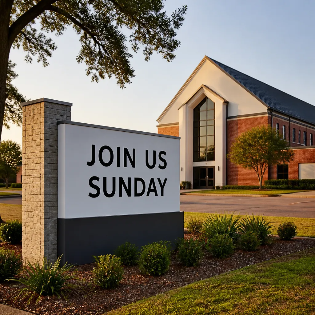
Think of the sign as a conversation at the front door. A driver may only have a few seconds, so each message needs to be understood in one glance. Rotating focused lines such as “Join us Sunday”, “Food pantry open Thursday”, or “You are welcome here” works far better than one crowded panel that tries to carry the whole year’s calendar.
If a passer-by needs to stop and read a paragraph, the sign has already failed.
The practical test is simple. Before you approve any wording, ask whether a first-time visitor would know what to do next after reading it once. If the answer is no, cut words until it does. Service times, an address line where needed, and one call to action are usually enough for the main board.
Service times belong on the permanent panel, not the rotating one. Anything that changes every week, like a sermon series or a guest speaker, belongs on a changeable insert or LED message. Keeping the two separate means the core information never disappears because someone ran out of space.
Legibility From the Road
Most church signs fail on legibility before anyone reads a word. Paint fades, vinyl lifts, and low-contrast colour combinations that looked smart in a design file disappear in afternoon sun. A common request is to repaint a faded board in the same colours, which is a natural instinct, but repainting only works if the contrast is improved at the same time.
Letter size and spacing for moving traffic
Letters need to be sized for the speed of the road, not for the person standing beside the board. Thin script fonts, tightly spaced capitals, and long words set in lowercase all slow reading down. Use a bold sans serif for the main name and time, and keep secondary lines noticeably smaller so the hierarchy is obvious at a glance.
Contrast and why faded paint fails
The most reliable combinations are dark letters on a light ground, or light letters on a dark ground with a matte finish. Yellow on white looks bright in a showroom but washes out quickly. Relief lettering can look elegant up close, yet it casts shadows and disappears at dusk unless it is lit. Contrast decides whether a sign works at all, so judge it in the light the sign will actually face.
Pro tip: Stand at the point on the approach road where a driver first has a clear line of sight to the board, then read the main message aloud. If you have to lean forward or squint, the lettering is too small or the contrast is too weak.
Lighting for LED and backlit boards
Illumination helps only when it is controlled. A bright LED board facing a row of houses can become a complaint, so set a dimming schedule that drops brightness after dark. Check that the display stays readable in direct sun as well as at night, because many displays look fine indoors and wash out outside.
Wayfinding Inside the Building
Visitors rarely get lost in the main hall. They get lost at the second corridor, the unmarked stairwell, or the door that looks like it should lead somewhere but does not. The step-by-step church signage guide in our references starts with a walkthrough for exactly this reason: you cannot fix a route you have never walked as a stranger.
Walk the building with fresh eyes
Carry a floor plan, mark every intersection, and enter through each door a guest might use, including the side gate and the car park entrance. Bring someone who has never attended before, or an outside consultant if the budget allows. Members stop noticing confusing routes after a few years, and that blindness is the main reason inside signage goes wrong.
Note every point where a person has to choose between two directions. Those decision points need a sign, a clear arrow, and a short label. Corridors with no decisions can usually go unsigned.
Directional signs at every decision point
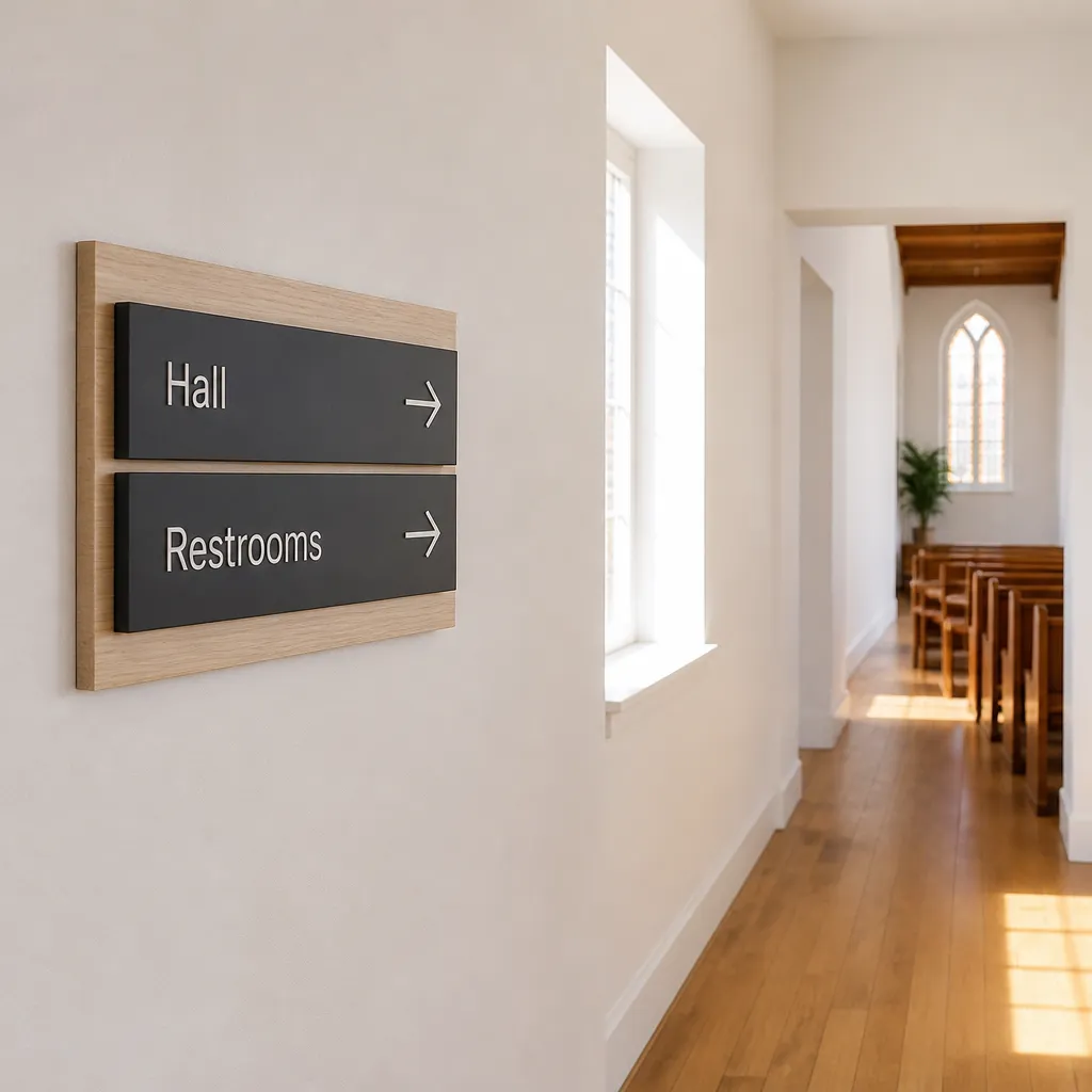
Write directions the way a nervous first-time visitor would read them. “Worship Centre, straight ahead” is clearer than a compass reference, and “Toilets, ground floor, left” is clearer than an icon alone. Keep arrow direction consistent, mount signs at eye height, and avoid placing them behind doors that swing into the path.
Many people who visit religious venues arrive with children, elderly relatives, or wheelchairs. Place signs where they can be read without stepping into the flow of traffic.
Labels for nurseries, restrooms and accessible entrances
Practical labels do most of the work. A nursery, a sound booth, or a pastoral office should carry the same wording on every sign in the building, so a volunteer can give directions over the phone and the visitor can match the words to the door. Accessible entrances should use the same term as your website and printed materials.
Pro tip: Photograph each decision point during the walkthrough and mark the photo with the sign you intend to install. Your installer and your volunteers can then agree on placement before anything is drilled into a wall.
A Weekly Message Rhythm That Keeps Signs Fresh
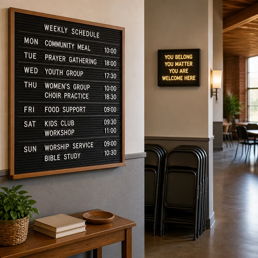
A sign that changes randomly looks busy, and a sign that never changes looks abandoned. A fixed weekly rhythm solves both problems. Volunteers know which kind of message goes up on which day, and the community learns where to look for updates. One published church LED guide builds its schedule around a Monday verse, midweek groups, a Thursday sermon theme, and a Saturday reminder with the Sunday times.
We recommend that churches draft the whole month’s rotation at once, then adjust only the details each week. The most common failure is not a lack of ideas. It is a sign updated late on Sunday night when nobody is available to check the wording.
Message templates that stay short
Templates keep the sign consistent. A Saturday reminder such as “Worship Sunday 9:30 and 11:00. All welcome.” works because it gives a day, a time, and an invitation in one line. Build a small set of these templates for regular services, midweek groups, community services, and special events, then fill in the blanks each week.
Seasonal planning for December services
With the year-end season now under way, Advent gatherings, Christmas Eve services, and holiday closures should be drafted in November and approved before the first week of December. A sign that announces the Christmas Eve service on the morning of the service is wasted effort. Plan the seasonal panel early, then schedule the switch so it goes up before the first invitation is needed.
Pro tip: Keep a shared document with the rotation calendar and the approved wording for each template. Anyone who updates the sign should copy from that document rather than writing new text under pressure.
Choosing a Sign Type: Static, Changeable or Digital
No single sign type suits every church. The right choice depends on how often your message changes, who maintains the board, and whether the sign faces a road or a courtyard. Indoor and outdoor signs also differ in materials and durability, so a board specified for a foyer should not be placed in the weather without checking what it is built from. The guide comparing indoor and outdoor signs in our references covers that trade-off in more detail.
Static boards and relief lettering
A static board with painted or relief lettering suits churches whose core information rarely changes. It looks dignified, needs little power, and works well at the entrance. The weakness is that anything temporary needs a separate insert, and paint needs refreshing every few years in harsh sun.
Changeable letter boards for smaller congregations
Manual changeable letters are cheap to run and simple to maintain. They suit congregations that update once or twice a week and have a volunteer who can climb a ladder safely. The risks are untidy spelling, missing letters, and boards that stay on an old message for months.
LED displays and the content discipline they demand
Digital LED signs allow rotating messages and scheduled changes, which is valuable for busy venues. They also make it tempting to show too much. Use one message per frame, hold each frame long enough to read, and avoid scrolling text that moves faster than a driver can follow.
| Sign type | Best for | Watch out for |
|---|---|---|
| Static board with painted or relief lettering | Stable core information such as service times and the church name | Fading in strong sun and no room for weekly updates |
| Manual changeable letter board | Small congregations updating once or twice a week | Untidy wording and old messages left up too long |
| LED digital display | Venues with several weekly events and community notices | Overloaded frames and glare for neighbours after dark |
In practice, many churches combine a static board for the name and times with a smaller LED or changeable panel for the week. That split protects the core information and gives the weekly messages room to change without repainting anything.
Community Organisation Signs for Shared Venues
Many religious venues in Gauteng are used by more than the congregation. Crèches, support groups, food programmes, sports clubs, and visiting organisations all rely on the building, and each needs signage that tells people where to go. Getting this right builds goodwill with the wider community. Getting it wrong creates confusion at the door.
Naming the group and its hours
A community sign should state the name of the organisation, the service it offers, the days and times, and who to contact. “Food parcels, Thursdays 10:00 to 12:00, enter at the side gate” is a complete message. A vague line such as “Community help here” sends people away because they cannot tell whether they qualify or whether the door is the right one.
Shared halls and rotating users
Halls used by different groups across the week need a removable insert system. Fix the building name and address on a permanent panel, then slide in the group name and hours for each user. This stops the board from advertising a group that left two months ago.
Permission and neutral wording
Obtain written permission before printing another organisation’s name, logo, or contact details. Keep the wording neutral and avoid language that suggests the church endorses a political or commercial activity. If a group funds part of the signage, agree in writing who controls the message and who approves changes.
Pro tip: Ask each hall user for their preferred name, hours, and contact line on one form, then print only from that form. Most disputes on shared boards start with a sign that was updated from a phone message.
Consistent Identity and Installation Across Sites
Multi-site churches, denominational groups, and franchised ministries face a particular problem: each building ends up with a different sign, different colours, and different fonts. Visitors who attend one campus and then drive to another should recognise the same organisation within seconds. SignShopper works with corporate clients who depend on this kind of identity discipline, and the same principles apply to churches with several sites.
One identity sheet for every site
Create a one-page identity sheet covering the logo, approved colours, font families, minimum clear space around the logo, and standard wording for service times. Give it to every site leader and every sign supplier. Most inconsistency comes from a well-meaning volunteer who redesigned a board with whatever software was to hand.
Permits, landlords and installation planning
Sign approval rules vary between municipalities, and landlords or body corporates may have their own requirements for buildings they manage. Check both before ordering, because a sign installed without approval can be ordered down or removed. Plan the installation around the structure as well. A wall that cannot take the weight of a large LED panel needs a structural check first.
Maintenance that keeps the sign reading well
Schedule a monthly check covering lighting, cleaning, loose fixings, and faded vinyl. Replace a failing bulb or LED module promptly, because a sign with a dead section looks abandoned from the road. Record the date of each service so the next person knows when the last check happened.
Frequently Asked Questions
How much text should a church sign carry?
Keep the main board to the church name, service times, and one invitation line. Rotating messages should carry one idea each, ideally readable in about three seconds.
Do we need municipal approval before installing a church sign in Gauteng?
Usually you need to check. Requirements differ between municipalities, and landlords or body corporates may add their own conditions. Confirm both before ordering, because approval is the municipality’s decision and not the supplier’s.
Is an LED sign better than a painted board for a church?
Not automatically. An LED sign suits venues that change messages often and have a reliable power supply. A painted or relief board suits a stable message and a tighter budget. Many churches use both, with a static panel for the name and times and a smaller digital or changeable panel for the week.
How often should the message on our sign change?
Update the rotating message at least once a week, and change any time-sensitive notice as soon as it is confirmed. A message left unchanged for a month tells the community the building is no longer active.
Can we display another organisation’s name on our church sign?
Yes, with written permission from that organisation. Agree in advance who approves the wording, how long their panel stays up, and what happens when they stop using the space.
What colour combination works best for legibility?
High contrast works best: dark letters on a light background or light letters on a dark background, with a matte finish to reduce glare. Test the combination under the lighting it will face at night and in strong midday sun.
Which message has your congregation or community group found works best on a sign, and what would you change about your current board?
References
- Church LED sign guide with message templates and weekly scheduling ideas
- Step-by-step guide to church signage, starting with a building walkthrough
- Comparison of indoor and outdoor sign durability and best use cases