


Point-of-Sale Signage South Africa: Displays That Sell
Most shoppers decide whether to buy something in the few seconds after they stop walking. The sign beside the till, on the end of an aisle or at eye level near the fridge often makes the difference between a browser and a buyer. In Gauteng, where shopping centres, high streets and standalone stores compete for the same foot traffic, point of sale signage South Africa retailers use has to work quickly. This guide covers where to place in-store signs, how to make them readable from across a shop, how to keep a chain of branches on one brand, and which approvals people tend to forget until a sign is already on the wall.
Table of Contents
- Quick Takeaways
- Why In-Store Signs Decide the Sale
- Placement: Putting Signs Where Decisions Happen
- Typography and Contrast That Read Across the Shop Floor
- Counter Toppers, Shelf Talkers and Floor Stands
- Digital Screens Versus Printed and Backlit Displays
- Keeping Franchise and Corporate Branches on One Brand
- Approvals, Installation and Landlord Rules
- Measuring Whether a Sign Converts
- Frequently Asked Questions
- References
Quick Takeaways
| Key Insight | Explanation |
|---|---|
| Place the sign where the decision happens | Promotions belong at the till, the end of an aisle and just inside the entrance, where a shopper has already slowed down or stopped. |
| Give each sign one message | One headline, one offer and one instruction. A shopper scanning from a few metres away will not read a paragraph. |
| Choose contrast before decoration | Dark text on a light background, or the reverse, reads faster than gradients, thin script fonts or busy photography. |
| Mix printed and illuminated signs | Backlit units hold attention in dim corners, while printed cards are cheaper to replace when a promotion changes every few weeks. |
| Lock the brand kit before the first install | Colours, fonts and logo placement should be fixed across every branch so customers recognise the brand wherever they shop. |
| Clear approvals before fabrication | Municipal rules and landlord guidelines can limit size, illumination and position. Check them before ordering, not after the sign goes up. |
Why In-Store Signs Decide the Sale
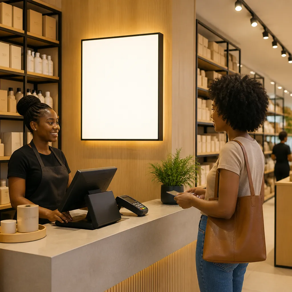
A storefront sign gets a shopper through the door, but it rarely closes the sale. Once someone is inside, they scan for a reason to pick up a product, compare prices or ask a member of staff. Lightspeed's retail signage guide groups signage around three roles: marketing, customer experience and regulatory compliance. Inside the shop, the first two do most of the work, because a shopper who finds the offer or the aisle quickly keeps browsing.
The three jobs an in-store sign does
In practice, every sign in a shop should do one of three things. It should promote something, inform the shopper about something they need to know, or help them find their way. A sign that tries to do all three at once usually does none of them well. A buy-one-get-one card at the till promotes, a price ticket on a fridge door informs, and an overhead aisle heading directs traffic.
Lightspeed also notes that a poster inside a shop can announce a limited-time deal, much like a sidewalk A-frame does outside. The indoor version only works if it sits where the shopper has already stopped moving. A poster on a wall they walk past on the way to the shelves is decoration, not promotion.
Signs also save staff time. A clear card that explains a returns policy, a layby option or a loyalty scheme means the cashier answers fewer repeat questions during a busy hour. That gain rarely appears in a sales report, but customers feel it at the counter.
A sign that needs a second look has already lost part of its job.
Placement: Putting Signs Where Decisions Happen
Placement matters more than finish. A well-made sign mounted at knee height behind a display case will underperform a plain printed card at eye level beside the product. Start by mapping where shoppers pause: the entrance, the first few steps past it, the till and the end of each aisle. The rest of the sign plan follows from that map.
Walk the shop as a customer would. Stand at the door, then walk to the main product zone and note where your eyes rest without effort. Check where a sign would be blocked by a stacked carton, a hanging garment or a staff member standing in front of it. In our experience, most sign problems in a shop are obstructions, not design flaws.
The till and the checkout queue
The till area is the most valuable space in most shops, and it is usually crowded with card machines and loose stock. Keep one clear sign there that a waiting customer can read without leaning forward. Impulse products work best when the sign names the item and its price, such as "Phone charger, add to your order", rather than a vague category like "Accessories".
Pro tip: Stand in the queue position yourself during a busy hour and read the till sign from there. If you have to step out of line to see the offer, move the sign or make the text larger.
End caps and aisle heads
The end of an aisle is a natural stopping point because shoppers turn into it with their bodies already facing the shelves. An aisle head that names the category, such as "Braai and charcoal" or "School stationery", tells the shopper they are in the right place before they walk the full length. Use the same sign style on every aisle so the system is easy to learn.
Typography and Contrast That Read Across the Shop Floor
Readability is the first test for any in-store sign, and it fails more often than people expect. A design guide from National Graphics recommends prioritising clear, simple messages with high-contrast colours, and it points to sans-serif typefaces such as Arial or Helvetica for their clean lines. Those recommendations hold up in a shop, where a sign may need to work under mixed lighting and from several metres away.
We advise clients to test a sign at the distance a shopper will actually stand. Print a draft at full size, pin it up at the spot, and walk back to the point where a customer would first notice it. If you cannot read the price or the offer from that spot, the sign is too small or the font is too light.
Font size and line length
Headlines should carry the offer, and supporting text should be short enough to read in one glance. Avoid long lines of small text on a shelf strip, because the shopper will skip it. A headline in heavy weight, a single price and one line of conditions usually works better than three paragraphs of terms.
Colour pairs that fail under shop lighting
Red on black, yellow on white and pale grey on cream are common choices that look bold on a designer's screen and fade on a shop wall. Under strong spotlights, glossy finishes can also cause glare that washes out the text. Matte finishes and simple two-colour combinations are safer, especially for signs that stay up for weeks.
Pro tip: Keep a single high-contrast version of your brand colours for all in-store text, and reserve the decorative palette for backgrounds and borders.
Counter Toppers, Shelf Talkers and Floor Stands
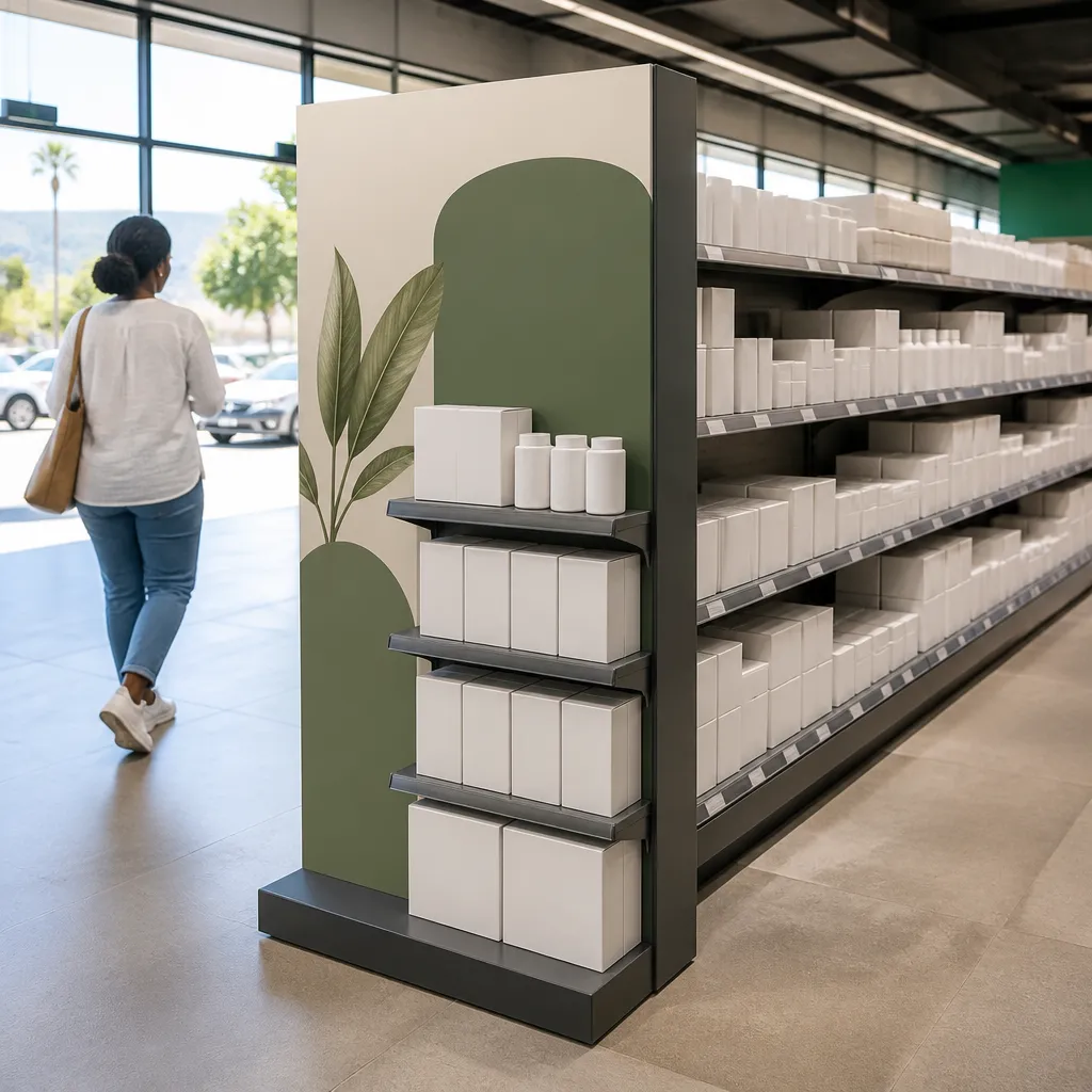
Most in-store promotions rely on small formats rather than large fixtures. Counter toppers sit beside the till, shelf talkers clip to the front edge of a product, and floor stands hold a product or offer at the entrance to a zone. Each format does a different job, so choose it based on where the decision happens, not on what the supplier has in stock.
Shelf talkers and edge strips
Shelf talkers and edge strips are the cheapest way to tie a price to a product. They work best when they are attached to the shelf edge directly below the item, so the shopper's eye moves from the sign to the product without a break. Replace them when the price changes. A talker that shows last month's offer does more harm than having no talker at all.
Floor stands for short campaigns
Floor stands earn their space when a product needs a visible launch, such as a seasonal range or a limited edition line. Many retailers do not need to own a stand for a six-week campaign. Rental options can cover the period, and the stand can be collected once the promotion ends. Plan the stand's position with the store layout in mind, so it does not block the main walkway or the exit.
Digital Screens Versus Printed and Backlit Displays
The question we hear most often is whether a screen is worth the money. The honest answer is that it depends on how often the content changes and whether you have staff to manage it. Screenfluence argues that dynamic, timely content keeps customers engaged and can lead to higher conversion rates, and that is a fair description of what a well-run screen does. The catch is that a screen showing an out-of-date promotion costs you more than a printed card would.
The table below compares the three formats most retailers consider. The right choice is rarely the most advanced one. It is the one your team can keep current.
| Display type | Best use | Main drawback |
|---|---|---|
| Printed posters, shelf talkers and counter cards | Weekly promotions, price changes and regular information such as opening hours or payment options | Needs manual replacement, and it can look tired if it stays up too long |
| Backlit or LED light boxes | Permanent brand messages, dim corners and areas where a sign must hold attention all day | Higher upfront cost, and it needs power and a maintenance plan |
| Digital screens | Frequently changing content, multiple offers in rotation and centres with a dedicated content owner | Needs a content workflow, hardware support and a fallback if the screen goes offline |
When screens earn their cost
A screen makes sense when you change offers several times a week, or when different offers should run at different times of day. A clothing store with a lunchtime promotion and an evening range launch can use one screen to cover both. Without a clear owner for the content, though, the screen becomes a dark rectangle that customers stop noticing.
Where printed signs still win
Printed signs remain the stronger option for most small and mid-sized stores. They are quick to produce, easy to replace and do not depend on a working network. A printed sign with a well-chosen offer and a clear headline will outperform a poorly planned screen in almost every shop we have worked with.
Keeping Franchise and Corporate Branches on One Brand
For franchise owners and corporate retailers, the biggest in-store risk is not a bad sign. It is a set of signs that look like they come from different companies. A customer who sees a crisp, consistent display in one branch and a mismatched poster in another starts to question the business. Brand consistency is not a cosmetic concern. It is part of the shopping experience.
The solution is a written sign standard that every branch can follow without needing to call head office for every decision. That standard should cover logo placement, approved colours, font families, minimum text sizes and the templates for each format. It should also say who approves new artwork and how long approval takes.
A sign standard every branch can follow
Keep the standard short enough that a branch manager reads it in one sitting. Include a one-page guide for each format, with the approved sizes, the safe zones around the logo and a sample layout. Where possible, store the approved templates in a shared folder so a store can order a replacement card without redesigning it.
Local promotions without breaking the brand
Branches often need to promote local events, staff picks or weekend offers. Give them a fixed template with one editable field for the offer and one for the date. This keeps the look consistent while allowing the store to respond quickly. A branch that cannot change its promotion without waiting for approval will simply stop changing it.
Approvals, Installation and Landlord Rules
Many retailers plan the design carefully and then discover that a sign cannot go where they wanted it. Lightspeed advises checking with local government to learn which signs are allowed, because there may be limits on size and type, and some signs need a permit. Interior signs usually face fewer restrictions than external ones, but that does not mean they are exempt from every rule. In shopping centres, the landlord's signage guidelines often apply as well, and they can be stricter than the municipality.

Municipal and landlord approvals
Ask for the approval requirements before you order fabrication. Give the landlord or centre management the drawings, the dimensions, the materials and the illumination details, and ask whether any of those need written sign-off. A refusal at this stage costs a few days. A refusal after installation can cost the full sign and the cost of removing it.
Installation timing around trading hours
Plan installations for quiet trading hours or for a closed day where possible. A ladder in a busy aisle is a safety risk, and a half-finished sign in the middle of a promotion looks worse than no sign at all. Confirm power points, mounting surfaces and any cable routing before the installation team arrives, so the job is completed in one visit.
Pro tip: Photograph the wall, ceiling and power points before you finalise the design. Those photos often reveal a clash with a fire sprinkler, a ceiling fixture or a wall that cannot take a heavy light box.
Measuring Whether a Sign Converts
A sign is only worth keeping if it changes what customers do. The problem is that most retailers measure signs by feel. Stratus Unlimited, a signage provider writing about convenience stores, cites a figure of up to 30% in sales growth from in-store signage, particularly when it supports limited-time offers. Treat that number as one provider's claim, not a guarantee. Your own shop should be the test.
A simple before and after check is enough for most stores. Choose one product or offer, record its sales for two weeks without a sign, then add the sign and record sales for the next two weeks. Keep the price, the staffing and the location of the product the same. The result will not be perfect, but it will tell you whether the sign earned its cost.
Simple before and after tests
Run one change at a time. If you move a sign and change the price in the same week, you will not know which one made the difference. Note any external factors too, such as school holidays, weather or a nearby event. A short written log is more useful than a complicated dashboard.
Reading the till data
Look at units sold per product, average basket size and the number of transactions that include the promoted item. If the promoted item sells more but the basket size falls, the sign may be pulling shoppers away from higher-value items. That is worth fixing before you renew the campaign.
The best in-store sign is the one your team can change in an afternoon without a meeting.
Frequently Asked Questions
How much does point of sale signage cost in South Africa?
The cost depends on size, material, whether the sign is illuminated and how often it needs replacing. A printed counter card is far cheaper than a backlit light box, and a digital screen adds hardware and content costs. Ask for quotes that show the design, production, delivery and installation separately, so you can compare like with like.
Do I need approval for an in-store sign?
Interior signs usually face fewer restrictions than external signs, but you should still check with your municipality and your landlord. A shopping centre may have its own rules on size, illumination and position, even for signs placed inside your unit. Ask before you order, because a refusal after installation is expensive to fix.
Where should a point of sale sign go in a small shop?
Place the most important sign at the till or just inside the entrance, where shoppers pause. Use one sign for the main offer and keep the rest of the wall clear. In a small shop, crowding the space with signs usually reduces the impact of each one.
How often should in-store signage be changed?
Change promotional signs whenever the offer changes, and check permanent signs every few months for fading, damage or outdated information. A sign that shows an expired offer damages trust with customers, so set a regular review date and assign one person to own it.
Are digital screens worth it for a small retailer?
Usually not, unless the content changes often and someone on the team can manage it every week. A well-designed printed sign is cheaper to produce, easier to replace and does not depend on a network connection. Consider a screen once you have a reliable content routine and a clear reason to show different offers at different times.
Can I rent point of sale displays for a short promotion?
Yes, rental is a practical option for seasonal campaigns, launches and short-term offers where buying a fixed display would not make sense. Confirm the rental period, the collection and installation arrangements, and what happens if the display is damaged during the campaign.
What has your store learned from its own in-store signs, and which placement made the biggest difference for your sales?
References
- Lightspeed guide to the marketing, customer experience and compliance roles of retail signage
- National Graphics guide to clarity, visuals and highlighting key information in in-store signage
- Stratus Unlimited article on in-store signage and convenience store sales growth
- Screenfluence article on digital signage, customer experience and conversion rates