


Café Signage South Africa: Building an Instagrammable Brand
Stand outside any busy café in Johannesburg on a Saturday morning and you will see the same thing: customers stop at the door, lift their phones, and frame the wall behind the counter before they even order. That habit is free marketing if you design for it, and a missed opportunity if you don't. Café signage South Africa owners install today has to do more than display a name. It has to read from the pavement, look right in a phone frame, and match the brand standards of any group it belongs to. This guide covers how to plan all three without wasting a rand.
Table of Contents
- Quick Takeaways
- The Local Coffee Market Your Sign Has to Compete In
- Exterior Signage That Gets Noticed From the Pavement
- Designing for the Camera Without Looking Like a Set
- Corporate Identity and Café Character Are Not Opposites
- Choosing Between Sign Technologies
- Lighting, Materials and Maintenance in the Gauteng Climate
- Event and Pop-Up Signage Without the Permanent Commitment
- Frequently Asked Questions
- References
Quick Takeaways
| Key Insight | Explanation |
|---|---|
| Design the fascia for a three-second read | Drivers stopped at a robot (traffic light) give your name only a moment. Put the café name and one visual cue at eye level, then test the sign from across the road. |
| Build one photo wall, not five | A single deliberate backdrop gets shared repeatedly. Scattered quotes and competing neon signs dilute every photo a customer takes. |
| Make the logo readable after dark | Many café photos are taken in the evening. Use backlit or halo-lit letters, and plan backup power for LED signs because power interruptions are a real part of running a Gauteng business. |
| Get the brand manual before you choose decor | Corporate and franchise standards settle the logo size, colours, typefaces, and mounting rules. Creative decisions should happen inside those limits, not after them. |
| Specify materials for the Highveld sun | Cheap vinyl and untreated acrylic fade and yellow quickly on a sunny frontage. Ask for laminate, UV-stabilised substrates, and UV-rated inks. |
| Use vinyl for temporary messages only | Printed vinyl suits seasonal offers and opening promotions. Using it for the main name usually means a replacement within the first year. |
| Budget for maintenance from day one | One dead letter or a cracked panel undoes the effect of a well-designed facade faster than anything else. Schedule quarterly checks and log them. |
The Local Coffee Market Your Sign Has to Compete In
Coffee culture in South Africa is younger than many people assume. Perfect Daily Grind's market breakdown reports that two-thirds of South African adults now drink coffee daily, yet instant coffee still dominates, with 76% of drinkers preferring it. That gap matters for signage, because your specialty café is competing with habit, and the sign is often the first thing that tells a passer-by you are not a quick instant stop.
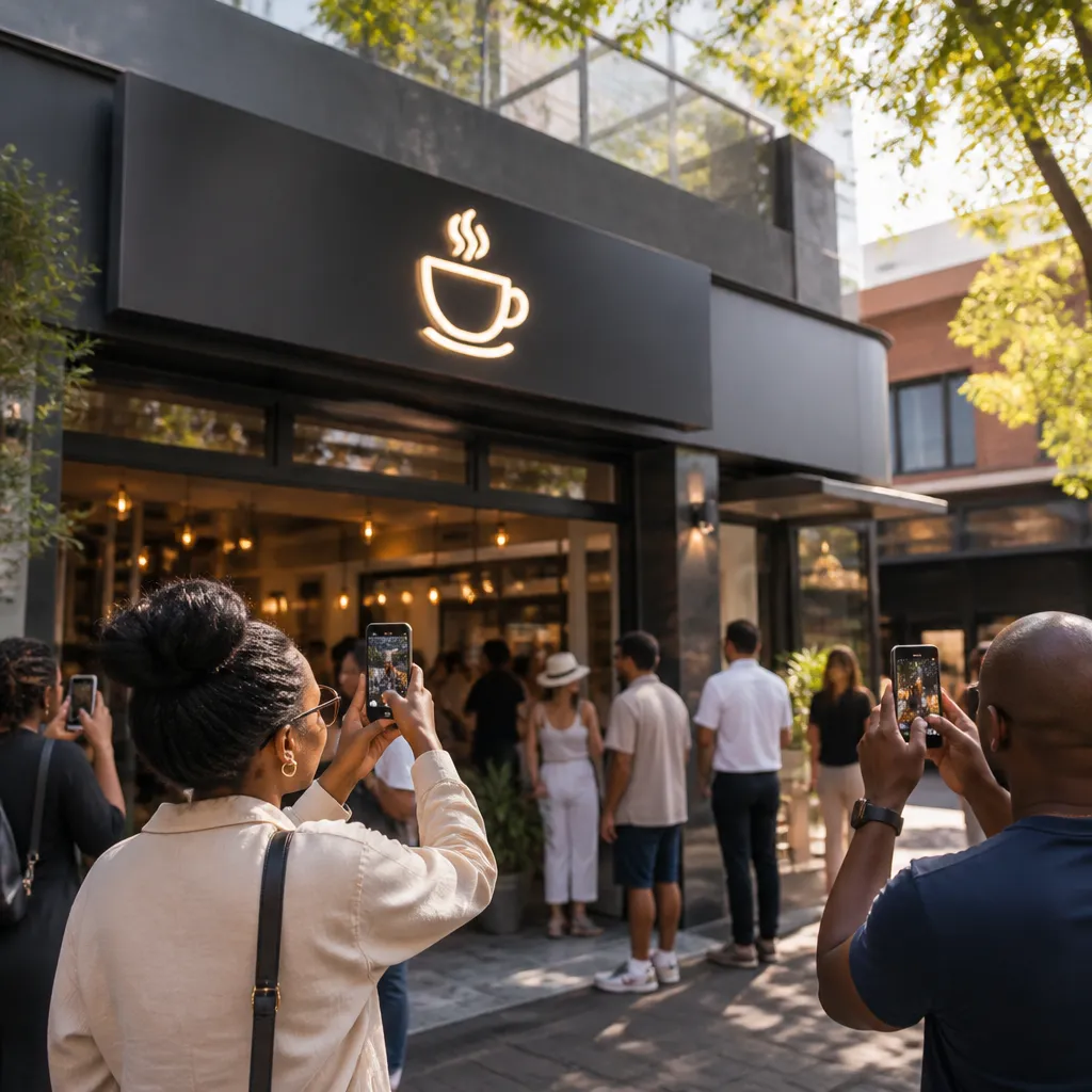
The same article points to Cape Town, Johannesburg, and Durban as the country's specialty coffee hotspots, and it identifies price sensitivity as a barrier that still holds back the specialty segment. For a Gauteng owner, the practical reading is simple: you are selling a premium experience to someone who is still comparing your flat white with a cheaper option. A sign that looks expensive but generic does not close that gap. A sign that looks deliberate, specific, and proud of the coffee does.
In practice, café owners tend to fall into two camps. The first treats signage as a compliance item and buys the cheapest fascia the landlord permits. The second treats it as the opening line of the brand story. The second group gets photographed, and photos bring in the next customer who was not sure whether to try the place.
Where the specialty customer actually comes from
The specialty customer rarely walks in cold. They find you through a friend's story, a map pin, or a post in their feed. The sign's job is to confirm the place they have already decided to check out. A clean name, a clear logo, and a café-specific cue such as a roastery mark or a hand-painted menu board make that confirmation fast.
A common mistake is copying the look of a chain you admire. Customers recognise a copy quickly, and a copy tells them you have no coffee story of your own. Use the sign to show what you roast, how you brew, or where the beans come from, even if that is only one line of text.
Exterior Signage That Gets Noticed From the Pavement
Most people who photograph your café will do it from the pavement, and many people who notice it at all will do so from a car. Design the exterior for the slower viewer, the driver stopped at a robot with three seconds to read what you are. If that driver cannot find the name, the pedestrian who might have stopped will not find it either.
Start with the name. A café name needs to be readable at full scale from the road, not just at close range from a menu board. Test this by standing across the street and asking whether you can read it without zooming. If you cannot, increase the letter height before you change the colour.
Fascia and channel lettering versus flat vinyl
Channel lettering, with individually fabricated letters that sit proud of the fascia and often glow from behind, gives depth that flat vinyl cannot match. It photographs well at dusk and still reads clearly in harsh midday light. Flat vinyl is cheaper and faster to change, which helps with seasonal menus, but it tends to look tired sooner unless it is laminated and kept out of the worst sun.
An Australian guide to Instagrammable cafés makes a point that holds in South Africa too: an outdoor mural, a sculpture, or an unexpected paint colour can become a photo opportunity before a customer even reaches the door. You do not need all three. You need one element that makes the frontage worth stopping for.
The one visual cue that stops the scroll
Give the façade one element that is unmistakably yours, such as a neon coffee cup, a backlit roastery stamp, a painted panel in the brand colour, or a sculptural sign. Pick one. Adding three competing features turns the frontage into noise, and noise is what passers-by ignore.
Pro tip: Stand on the pavement at the time of day you expect most visitors, then photograph your frontage with a phone. If you cannot find the logo in that photo within two seconds, the sign needs work before anything else gets fixed.
Designing for the Camera Without Looking Like a Set
An Instagrammable café is not the one with the most pink. It is the one where the sign, the wall behind the counter, and the cup on the table look like they belong to the same brand. Customers photograph what they can frame cleanly, so ask where a person standing at your door would point their phone.
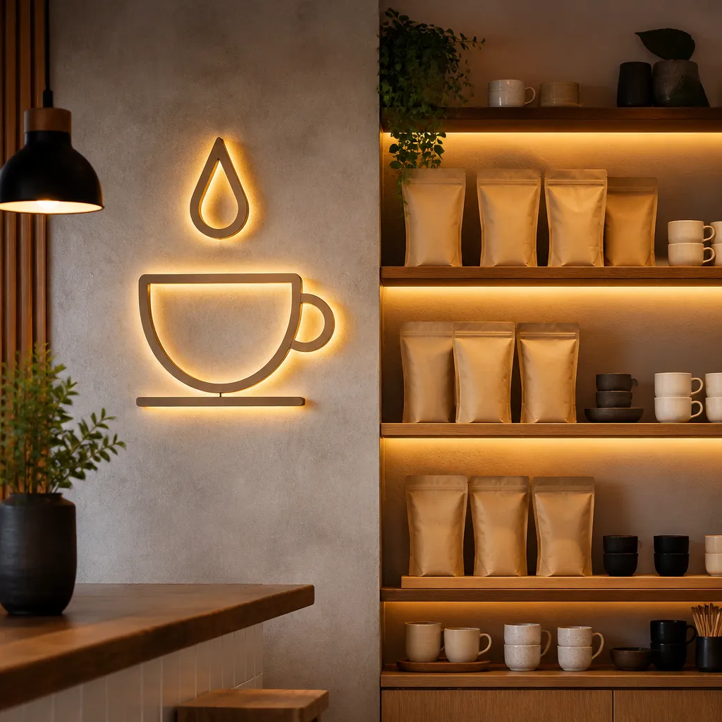
Pick one photo wall, not five. A single deliberate backdrop with your name, a clean typeface, and space for a person to stand in front of it will get shared again and again. Scattered quotes, three neon signs, and a chalkboard that changes its message every week split attention and make every photo look cluttered.
Pro tip: Ask two regular customers to photograph the wall during a normal visit and send you the pictures. The angle they choose is the one other people will copy, so build your lighting and seating around it.
Placement and sightlines
Put the photo wall where it does not block the queue or the coffee machine. In most Gauteng cafés, the best spot is the wall that customers face while they wait, which is also a wall your staff can see from the till. Light it from the front or the side so faces do not go flat under overhead downlights.
Customers rarely photograph your whole interior. They photograph the one spot that makes them look good, so design that spot first.
Neon, lettering and text that reads on a phone
Neon photographs warmly, but it fades the moment tubing or a transformer starts to fail, so budget for servicing. Typography matters more than most owners expect. Thin scripts can disappear in compressed phone images, so choose a bold sans serif or a robust script with a thick stroke. A useful test is whether the words on the wall still read at the size of a phone thumbnail.
Corporate Identity and Café Character Are Not Opposites
Franchise owners and corporate estate managers often assume that brand compliance kills creativity. In our experience it does not, as long as the creative work happens inside the rules. Corporate identity sets the logo, colours, typefaces, clear space, and mounting standards. Your café character lives in the materials, the photo moments, and the menu typography that the manual leaves open.
The mistake we see most often is treating the brand manual as a finish line rather than a starting point. A designer who reads it first can build a striking café around it. A designer who reads it last usually has to redo the artwork.
What to check in the brand manual before you design
Confirm the minimum logo size, the approved colour formats for LED and print, whether backlit faces can be illuminated, and how the group handles local signage approvals. Many disputes start with a designer who assumed a colour match that the printer could not hold on a translucent substrate.
Where franchises get the most room
Interior decor, seasonal menu boards, and window graphics usually allow more flexibility than the main fascia. A franchise can keep the exact logo on the frontage and use local artwork, a regional coffee origin story, or a hand-lettered specials board to make the room feel like it belongs to the neighbourhood.
Pro tip: Before you approve any installation, request the brand file in vector format and a colour reference for the exact material you are using. A colour that matches on a screen can look different on a backlit acrylic face at night.
Choosing Between Sign Technologies
Owners often ask whether they should choose LED-backlit signs, channel lettering, or neon. Our position is clear: channel lettering with LED backlighting is the default for a permanent fascia, neon works best for an interior feature wall or a window accent, and vinyl is for messages that will change soon. The table below shows the trade-offs in practical terms.
| Approach | Best Use in a Café | Main Trade-Off |
|---|---|---|
| Channel lettering with LED backlighting | Permanent fascia name and logo | Higher upfront cost, needs proper power supply and approvals |
| Neon feature sign | Interior photo wall or window accent | Fragile tubing, higher power draw, needs a servicing plan |
| Printed vinyl or banners | Seasonal offers, opening promotions, window graphics | Shorter lifespan in strong sun, less depth and presence |
A common mistake is using vinyl for the main name to save money, then replacing it within the first year. The saving rarely lasts, and the café looks temporary for as long as it is open.
Permits and landlord approvals
Municipal sign approvals and landlord consent often decide the frontage before the designer does, especially in shared buildings and shopping centres. Start those conversations in week one, not after the artwork has been signed off. A design that cannot be installed is only a mockup.
Lighting, Materials and Maintenance in the Gauteng Climate
Gauteng gives outdoor signage a hard life, with strong UV in summer, afternoon storms, dust in the dry months, and the occasional power interruption. Specify materials for those conditions rather than for a showroom photograph. The sign you approve should still look right after its first summer.
Power, backup and after-dark visibility
Power interruptions have made backup planning a real budget line for many Gauteng businesses. An LED sign that goes dark at six in the evening during an outage is not just an inconvenience, it is lost evening trade. Ask your installer whether the sign circuit can connect to backup power and where the transformer will sit so it can be reached for servicing.
Materials that survive the sun
Use UV-stabilised acrylic, laminated vinyl, and UV-rated inks. Cheap substrates yellow and crack within a season or two on a west-facing frontage. Keep the sign out of direct afternoon sun where you can, and where you cannot, plan a refresh cycle every few years rather than waiting for the material to fail.
Pro tip: Schedule a cleaning and a bulb or tube check every quarter, and log the date on a card kept at the till. The fastest way to undo an Instagram-ready facade is a sign with one dead letter that nobody has noticed for three weeks.
Event and Pop-Up Signage Without the Permanent Commitment
Many café brands run pop-ups at festivals, markets, corporate functions, or hotel lobbies, and those events are where a rental approach makes the most sense. SignShopper offers signage rental for businesses that need a premium look for a defined period without buying hardware they will use once. The same thinking applies to any café trying a new concept in a new location.
Pop-up kits that travel
A pop-up café needs a backdrop, a lit name panel, and a menu display that folds into a car boot or a van. Design the kit so two people can assemble it in under an hour. If it takes longer, the team will skip it at the next event, and the brand presence will drop with it.
Brand consistency across locations
When a café group runs a launch across several sites, the same kit ensures the photo looks identical everywhere. Customers notice when the pop-up at one venue looks nothing like the flagship, and that gap weakens the story the brand is trying to tell.
Frequently Asked Questions
What is the best sign type for a small café in Gauteng?
For a permanent frontage, LED-backlit channel lettering is usually the best value because it reads at night, holds its shape, and looks deliberate in photos. Use neon or a feature panel inside the café for the photo moment, and keep vinyl for offers that change.
How much should a café spend on its fascia sign?
There is no single figure that fits every frontage, because size, building type, and approval requirements vary widely. Get at least two detailed quotes that list materials, lighting, installation, and servicing separately, so you can compare like with like.
Do I need approval before installing a sign on a shopping centre frontage?
In most cases, yes. Landlords, body corporates, and local authorities often control what can be installed on a shared building. Confirm the approval chain before you commit to a design, because a rejected concept costs more time than the approval itself.
Will my café sign look good on Instagram at night?
It will if the lettering is backlit or halo-lit, the contrast is high, and the name is large enough to read on a phone. Take test photos at the hour you expect most visitors, and adjust the brightness before the sign is finalised.
How often should café signage be replaced?
Printed vinyl often needs replacing sooner than hard-face signs, especially on a sunny frontage. A well-specified LED sign can last for years with regular cleaning and servicing. Check the condition every quarter rather than waiting for visible damage.
Can I use a rental sign for a pop-up café?
Yes, rental works well for events, launches, and short-term locations where buying hardware makes no financial sense. Plan the kit for quick assembly and make sure the visual identity matches your permanent sites so the photos stay consistent.
Tell us which café frontage you last stopped to photograph, or what has worked for your own shop's photo moments, because the most useful ideas usually come from the people standing at the counter every day.
We would love your feedback and any insights you would share with others. What perspective would you add?