


Mall Kiosk Signage South Africa: Branding a Small Footprint
A kiosk in a South African shopping centre has a few seconds to answer one question: what do you sell, and is it worth stopping for? Most kiosks sit in a corridor between a pedestrian flow and a row of larger shops, so the sightline may last only as long as it takes to walk past. In Gauteng, where malls draw heavy traffic from commuters and weekend shoppers, the kiosk sign has to do the selling that a staff member cannot always do. Getting mall kiosk signage right is less about size and more about making a small footprint readable from the walkway. This guide covers how we approach that job at SignShopper, from brand identity and lighting to landlord rules and rental options.
Table of Contents
- Quick Takeaways
- Why Mall Kiosks Need a Different Signage Approach
- Building Brand Identity on a Small Footprint
- Lighting and Materials That Hold Up in Mall Conditions
- Corporate Identity Compliance for Franchise Kiosks
- Landlord Rules and Installation Realities
- Rental or Purchase: Choosing the Right Kiosk Setup
- Keeping Kiosk Signage Current Without Rebuilding It
- Frequently Asked Questions
- References
Quick Takeaways
| Key Insight | Explanation |
|---|---|
| Test the header from the corridor centreline | Shoppers decide from the walkway, so print a full-size mock-up and check legibility from the spot where people actually pass. |
| Lead with one message | A kiosk fascia has room for a brand name, a category, and one reason to stop. Anything beyond that gets ignored. |
| Split the job between fascia and counter | The fascia carries the brand while the counter shows the product. Repeating the same product photo in both places splits attention. |
| Get centre approval before printing | Management usually controls fascia size, fixing, lighting, and graphic content. Rejected artwork means reprints and lost weeks. |
| Lock colours to the franchise master file | Corporate identity audits focus on colour and logo use. Approve colour proofs on the actual substrate, not on a monitor. |
| Design for swapping, not rebuilding | A fixed brand zone and a removable promotion panel let staff change offers in minutes and keep the kiosk fresh. |
Why Mall Kiosks Need a Different Signage Approach
A mall kiosk does not get the luxury of a street frontage. It sits in a corridor, often between a busy pedestrian flow and another storefront, and the shopper decides within a few seconds whether to look closer. That makes the kiosk sign a sales tool first and a name board second.
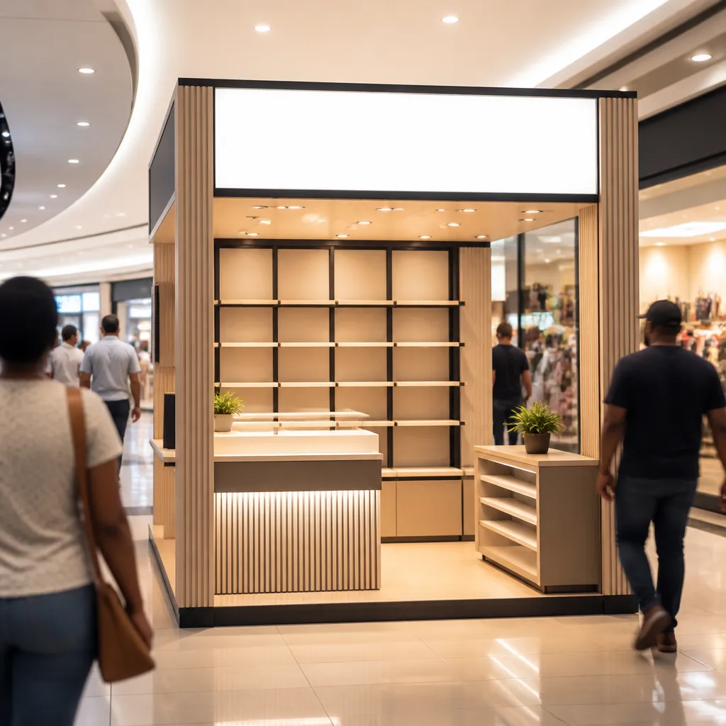
In practice, we start every kiosk brief by asking what a passer-by can read in the time it takes to walk three or four steps. If the answer is only the brand name, the kiosk is underperforming. A strong kiosk header names the business, signals the category, and gives one reason to stop.
The Walkway Viewing Window
Walkway visibility is tighter than most clients expect. A sign designed on a screen at arm's length often becomes hard to read from the middle of a corridor, where people carry bags, look at their phones, and move at different speeds. Test the artwork by printing a full-size mock-up of the header and standing where a shopper would stand. Do this in the actual centre, not in the showroom.
Why the Counter Does the Selling
Most kiosks have a counter, a display case, or a demonstration surface, and the sign has to work with those elements rather than compete with them. A common mistake is putting a large product photo on the fascia and then stocking the counter with the same product in a smaller format. The eye jumps between two messages and buys neither. Keep the fascia for the brand and the counter for the product, and let the two reinforce each other.
Pro tip: Photograph the kiosk site from the centre of the corridor at the time of day when footfall peaks, then mock up the header on that photo before you approve any artwork.
Building Brand Identity on a Small Footprint
Brand identity on a kiosk is a compression exercise. You keep the logo, the core colour, and the typeface, and you drop everything that is supporting copy. Corporate clients often ask for the full brand story on every panel, and that request usually kills legibility.
Choosing One Dominant Message
Pick one message for the fascia and one for the side panels, then stop there. A fascia that gives the brand name, the product category, and a loyalty offer equal sizes reads as noise. We usually recommend a dominant element, typically the logo or the product name, filling most of the header with a single supporting line beneath it.
Supporting lines should be short enough to read in one glance. If a line needs a second read, move it to a counter card or to the screen behind the counter, where a shopper who has already stopped can take it in.
Logo Scale and Clear Space
Logos fail on kiosks for a simple reason: they are placed too small or too close to a frame edge. Most brand guidelines specify minimum clear space around the logo, and on a small footprint that space gets squeezed by hardware, handles, and lighting boxes. Build the clear-space rule into the first draft rather than fitting it in at the end. A slightly smaller logo with proper space will almost always look more premium than a crowded one.
Pro tip: Ask the franchisor or the client for the full brand guideline before the first sketch. Colour and clear-space rules are far easier to design around at the start than to retrofit after sign-off.
Lighting and Materials That Hold Up in Mall Conditions
Lighting is where most kiosk signs win or lose their evening presence. A kiosk that looks bright in the workshop can disappear under the ambient light of a mall atrium, and a kiosk lit too hard can look cheap. The aim is to match the sign's brightness to the surrounding corridor rather than try to beat it.
Backlit Panels Versus Front-Lit Fascias
Backlit panels with a diffused face give an even glow and make a small header readable from a distance. They suit kiosks where the brand colour is a major part of recognition. Front-lit fascias, where light falls on a solid panel, are cheaper to run and simpler to repair, but they need careful positioning so they do not wash out in bright ambient light.
Gauteng centres run long trading hours, so the choice of lighting affects running costs as well as appearance. Ask for an estimate of the power draw and the expected lifespan of the lighting element before you commit. Also check how easily a faulty module can be replaced without removing the whole header.
Materials for High-Touch Surfaces
Kiosk surfaces get touched, leaned on, and cleaned with harsh products more than almost any other signage. Choose laminates and print films rated for that treatment, and avoid unprotected vinyl on any surface a shopper can reach. Edges and corners deserve the same attention, because they take the first knock and show wear first.
A kiosk sign is judged in the evening as much as in the daytime, so design and test it under the lighting it will actually live with.
Corporate Identity Compliance for Franchise Kiosks
Franchise networks depend on consistency. A customer who sees a red kiosk in one centre and a maroon one in another starts to wonder whether the outlets are connected. For franchisors and corporate retail clients, the kiosk is often the most visible place where that consistency is tested.
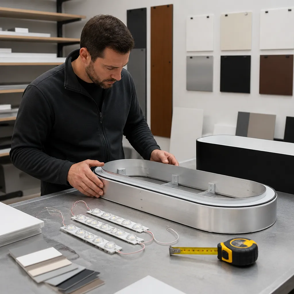
Corporate identity standards are strict about colour and logo use, and mall kiosks are often produced in several batches over time. Each reprint is a chance for drift. Our approach is to hold every kiosk to the same approved master file and to keep a record of the colour references used for each run.
Approved Master Files and Colour Matching
Colour is the most common point of failure. A print shop working from a screen colour value rather than a brand reference will produce a result that looks right on one batch and wrong on the next. Request colour proofs on the substrate you will actually use, and approve them against a physical swatch, not a monitor. Store the master file, colour references, and approved proofs together so the next reprint starts from the same point.
Who Signs Off on Changes
Franchise kiosks often pass through several hands, from the franchisee to a regional manager to the head office marketing team. Set the approval chain before the first print run, and make it clear who can authorise a seasonal change. Without this, promotional panels slip out of brand standards within a few months, and the kiosk drifts away from the rest of the network.
Landlord Rules and Installation Realities
A kiosk sign is only as good as its approval. Shopping centre management controls fascia dimensions, fixing methods, electrical connections, and in many cases the graphic content itself. Designs that ignore these rules often get rejected after printing, which turns a two-week job into a six-week one.
Getting Centre Management Approval
Ask for the centre's signage guidelines before you produce any artwork. These documents usually cover maximum sizes, permitted materials, lighting restrictions, and the approval process. Submit drawings with dimensions, fixing details, and a site photograph. Expect at least one round of comments, and build that time into the programme. Centre approval is a schedule item, not a formality.
Fixing, Access, and Trading Hours
Installation in an operating mall is a logistics job. Many centres restrict access to trading hours or early morning windows, and crews have to work around shoppers, stock deliveries, and cleaning schedules. We plan installations with the centre's operations team and pre-assemble sections where possible, so the time on site stays short.
Fixing methods matter too. Mall ceilings and columns vary, and a fixing that works in one corridor may be unsuitable in another. Confirm load and fixing details with the centre before drilling, and keep a record of every penetration so the removal stage at the end of the lease is not a guessing game.
Pro tip: Confirm the centre's approval timeline in writing before you commit to a launch date. Verbal assurances rarely survive a change in centre management staff.
Rental or Purchase: Choosing the Right Kiosk Setup
Not every kiosk needs a permanent sign. A pop-up promotion, a seasonal product launch, or a short lease can all be better served by rented equipment. The decision comes down to how long the kiosk will run, how often the message changes, and how much the centre allows you to alter the structure.
When Rental Makes Sense
Rental suits businesses testing a product in a new centre or running a campaign with a fixed end date. It also suits event venue managers who need a branded presence in several locations for a short window. The main benefit is that you avoid paying for a permanent fixing and removal cycle at the end of a campaign. SignShopper offers rental solutions for signage across Africa, which covers this kind of fixed-term need.
When Buying Makes Sense
Ownership makes sense when the kiosk sits inside a long lease, the design is stable, and the brand standard needs tight control across many sites. Buying also lets you specify materials and lighting to a higher standard, which pays off over a multi-year run.
| Option | Best For | Trade-off |
|---|---|---|
| Backlit fascia with printed face | Long-running permanent kiosks with a stable brand | Higher upfront cost, needs centre approval and a removal plan |
| Modular frame with swappable graphics | Retailers changing promotions every few weeks | Frame must meet the centre's standards, and graphics need careful print control |
| Fabric tension display with changeable panels | Short campaigns, pop-ups, and event venues | Less lighting impact and less durable in high-traffic corridors |
Pro tip: Ask for removal and making-good costs in the quote, not only installation costs. These are often left out, then appear as an unexpected bill at the end of the lease.
Keeping Kiosk Signage Current Without Rebuilding It
A kiosk that carries the same message for a year loses its reason to stop, and shoppers learn to walk past it. The fix is not a full rebuild each time. It is a structure designed to swap the parts that change while the brand elements stay fixed.
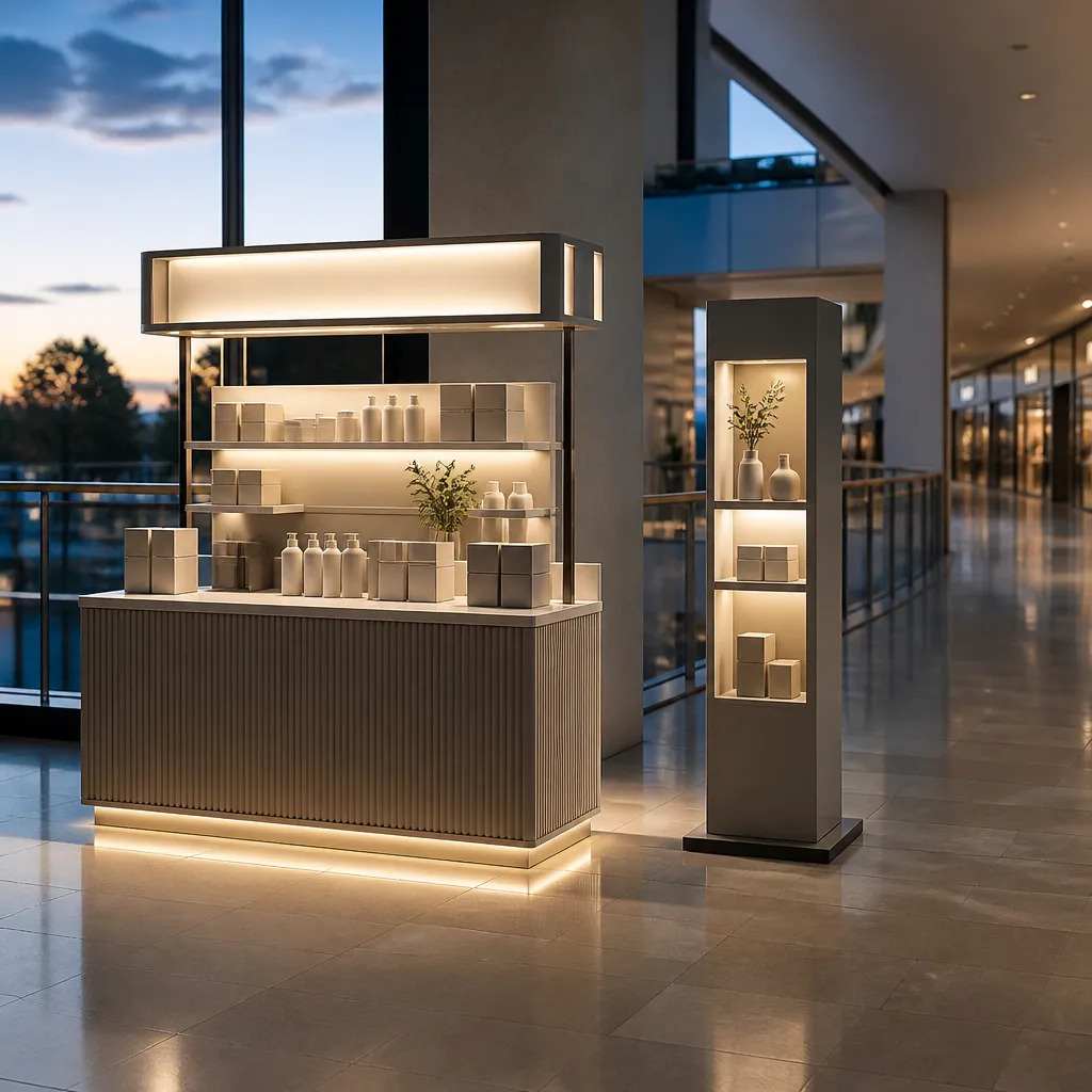
Design the header with a fixed brand zone and a removable promotion zone. The promotion zone should use a standard panel size and a simple clip or slide mechanism, so a single staff member can change it in minutes. Keep the artwork in the master file, so every swap uses approved colours and type.
Modular Graphic Swaps
The promotion panel is where most kiosks lose brand control. Staff under pressure print offers on whatever printer is available, in colours that do not match the master file. Limit who can order a panel, supply templates with locked colour values, and keep a short approval log. A kiosk that changes offers every few weeks only works if the changes still look like the same brand.
Maintenance Checks That Prevent Failures
Plan a monthly check covering lighting modules, panel edges, fixings, and cleanliness. Failed lights are among the most common complaints from centre managers, and a single dark module can make a kiosk look closed. Keep spare modules on site or with your service provider so repairs happen quickly rather than after a week of a dim, unbranded corner.
Frequently Asked Questions
How big should a mall kiosk sign be?
There is no single size, because each centre sets its own limits. Work from the centre's maximum dimensions, then test the header from the corridor centreline to confirm that the brand name and one message are readable.
Do I need landlord approval for a small kiosk sign?
In most cases, yes. Even small fascias usually fall under the centre's signage rules, and approval covers size, materials, fixing, and lighting. Ask for the guidelines before you produce artwork.
Which lighting works best for kiosks in Gauteng malls?
Backlit or evenly lit panels usually work best because they hold their presence against bright interior lighting. Ask for a sample panel to be tested on site before you approve the final specification.
How often should kiosk graphics be changed?
For promotional kiosks, changing the offer every few weeks keeps the kiosk fresh. The permanent brand zone should stay fixed so the kiosk remains recognisable between promotions.
Can a franchise kiosk use a different design from the rest of the network?
Only within the limits of the franchise standard. Local promotions can change, but the logo, colours, and typeface should match the approved master file so the kiosk reads as part of the network.
What has your experience been with kiosk signage in a shopping centre, and which part of the process caused you the most trouble?