


Hospitality Signage Beyond the Lobby: Outdoor and Restaurant
Most hotel and restaurant owners in Gauteng spend their signage budget on the lobby, then wonder why guests miss the entrance, cannot find the pool, or walk past a restaurant with an empty terrace. The lobby is the last place a guest needs directions. The signs that fill rooms and tables sit outside, at the gate, along the pool deck and at the edge of the dining area. Effective hospitality signage South Africa operators can rely on starts at the property boundary, not at the front desk.
Table of Contents
- Quick Takeaways
- Why Outdoor Signage Decides Who Walks In
- Driveway, Gate and Road-Facing Signs for Hotels
- Pool Area Signage: Safety Rules Without the Warning-Wall Look
- Restaurant Zone Branding: Menus, Patios and Zone Edges
- Accessibility and Compliance for Guest Signs
- Comparing Outdoor Sign Types for Hotels and Restaurants
- Frequently Asked Questions
- References
Quick Takeaways
| Key Insight | Explanation |
|---|---|
| Outdoor signs reach guests who have not decided yet | Gate, road and pavement signs are read by people deciding whether to book or book a table, so they carry more sales weight than a lobby sign. |
| Design the gate for a few seconds of reading | Use the property name and one directional cue. Short names and large letters beat a paragraph of amenities on a board read at driving speed. |
| Keep pool rules on one board | Scattered rule signs get skimmed. One well-placed board with the brand header is read and remembered. |
| Give each restaurant zone a visible edge | Patio, bar, lounge and private dining need signs that show where each zone starts, while sharing one typeface and colour system. |
| Put the menu where the decision happens | A lit menu case visible from the path lets guests choose before they reach the host stand, which saves time for the team. |
| Confirm accessibility rules before ordering | Mounting height, contrast and tactile lettering are checked by inspectors. Use international guidance as a benchmark, then confirm the local requirements for your building. |
Why Outdoor Signage Decides Who Walks In
Most guests make their decision before they reach your door. They have seen the property on a map, a booking platform or a passing car, and outdoor signs are the only branding that reaches them at that stage. A lobby sign is only seen by people who have already chosen you.
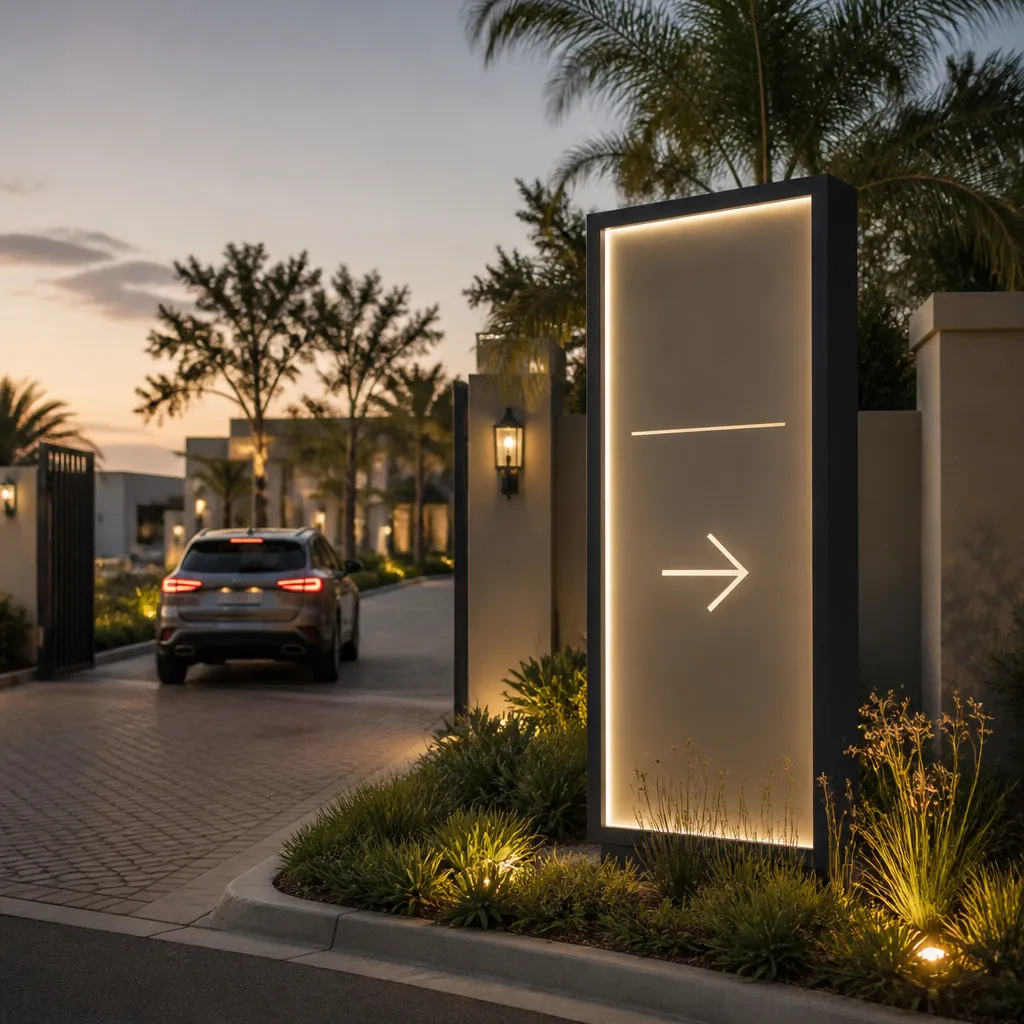
Samsung's guidance on outdoor restaurant signage makes the practical point well: outdoor signage can streamline operations by letting customers browse the menu before they even reach the door. That shifts routine questions away from the host stand and gives guests a reason to walk in rather than keep driving.
Menu cases that work from the pavement
A menu case only does its job if someone standing at the kerb can read the prices without stepping closer. That means a lit case, a menu with a few lines per item, and a position that is not hidden behind a planter or a parked car. Update the menu the day it changes, because a stale price on the pavement damages trust faster than no menu at all.
Mount the case at eye level for an average adult and test the lighting after dark. Many restaurants get the daytime layout right and then fail on the evening shift, when the dining room looks busy but the outside looks dead.
What research says about outdoor restaurant signs
A 2022 study indexed on ScienceDirect investigates whether restaurants' outdoor signs influence customers' perceptions and behavioural intentions. The question matters because a sign is a decision signal, not decoration. If your sign changes how someone feels before they enter, it belongs in the same budget conversation as your menu and your opening hours.
Pro tip: Photograph your outdoor signs at 7 pm on a weeknight from the height of a car windscreen. If you cannot read the prices in that photo, neither can your guests.
Driveway, Gate and Road-Facing Signs for Hotels
A guest arriving by car reads signs at walking speed, but a driver approaching a gate has only seconds. Many hotels and conference venues in Gauteng sit back from the road behind boundary walls or security gates, so the gate sign is often the only sign a passing driver sees. Treat it as the front door of the property, not as a boundary marker.
Designing for the driver's few seconds
Use the hotel name and one directional cue on the gate sign. Arrows, valet instructions and parking directions belong on secondary signs further along the driveway, where a driver has slowed down and can read more. A common mistake is putting the full brand lockup, a tagline and a list of facilities on one board that has to be read at speed.
Large, high-contrast lettering works better than a fine script font, even when the script looks more premium at your desk. If the sign is illuminated, check it at night from the road, not from inside the property where the glare looks different.
Wayfinding from the gate to check-in
Good wayfinding repeats one clear sequence. The gate names the property, the driveway points to arrival, and the entrance confirms it. Each step should use the same typeface and colour as the lobby sign, so a guest who has read one sign trusts the next.
A hospitality signage guide makes the same point about design: signs should align with the architectural style and interior of the building. A modern glass façade and a heritage stone entrance need different sign profiles, even when the brand palette is identical.
Pro tip: Stand at the gate after installation and ask someone who has never visited to read the property name aloud. If they hesitate beyond five seconds, shorten the name or enlarge the lettering before the next event season.
Pool Area Signage: Safety Rules Without the Warning-Wall Look
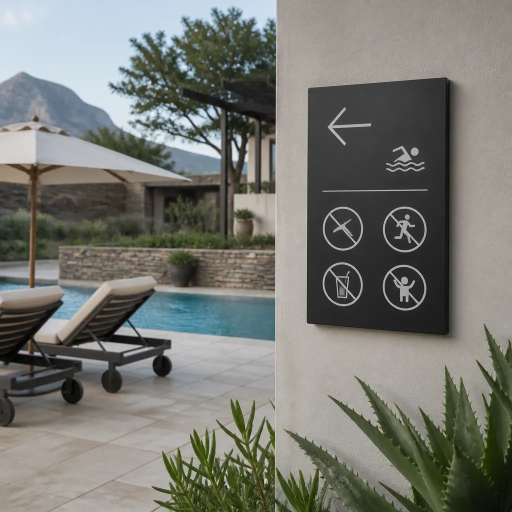
Pool areas are where safety signage and brand signage collide. Guests expect a clean, resort-style deck, but the rules, depth markings and emergency information still have to be visible and legible. The usual mistake is treating every rule as a separate sign until the fence line looks like a warning wall.
Consolidating rules onto one board
Put the core rules on one board at the pool entrance, using the same header and typeface as the hotel's main signage. Guests read one board and remember it. Five small signs scattered along the deck get skimmed, and the important rule disappears into the noise.
Keep the wording plain. Rules that run to a full paragraph are rarely read at the water's edge, so keep each one to a short line and let the board carry the detail.
Branding the deck without competing with safety
Use brand colour on the frame, the background panel or the header strip, and keep safety text in high-contrast colours that do not rely on the brand palette. A brand-coloured sign with pale text can look elegant in a render, then fail in strong sunlight and at dusk. Safety legibility comes first, and the brand still looks intentional on the frame.
Cabana numbers, towel service and lounger signs are where the brand can relax a little. Produce them in the same material and finish as the rules board so the deck reads as one property rather than a collection of add-ons.
Pro tip: Check pool signs at the times guests actually use the deck. A sign that reads well at noon can wash out in glare by four in the afternoon, so test the contrast in both conditions before you approve the install.
Restaurant Zone Branding: Menus, Patios and Zone Edges
A hotel restaurant is rarely one space. The main dining room, the terrace, the bar, the pool grill and the private dining room each need to feel part of one brand while still telling guests where they are. Restaurant zone branding is the work of making those edges visible without turning every area into a separate business.
Marking the start and end of a patio
Patios fail when they look like an afterthought. A low, well-lit sign at the entry, a branded post or a planter line with the restaurant name tells guests where the seated area begins. The edge matters for staff too, because a clear boundary helps the team see which tables are in service after hours.
Make the boundary sign small enough to avoid blocking the view, but large enough to read from the path. A patio sign that competes with the view will get removed by the first event manager who wants a clean photo.
Menu boards for table service and walk-ups
Separate the menu board for walk-up guests from the one used by seated guests. Walk-up menus need item names and prices at a glance. Seated menus can carry more description, but they should still match the outside board, so guests do not feel they have been handed a different menu after they sit down.
The most effective menu boards are the ones you can update in under ten minutes. If changing a daily special requires a new print run, the board will show last month's offer by the second week.
Bars, lounges and private dining without brand confusion
Each sub-zone can carry its own name, such as lounge or bar, but the typography, colour and sign shape should match the main restaurant. Guests should recognise the family of signs before they read any words. Private dining rooms usually need quieter signage, often a discreet door plate, because the room is booked by a client who does not want it advertised to passers-by.
A sign that needs a paragraph of explanation has already failed at the job it was built to do.
Accessibility and Compliance for Guest Signs
Accessibility is where hospitality signage moves from design preference to inspection risk. Signs for entrances, restrooms, room numbers and exits are the ones most likely to be checked, and they are the ones guests rely on most. Build accessibility into the brief from the first design round, not as a retrofit after installation.
Benchmarks from US accessibility guidance
US guidance for restaurant signage is often used as a practical benchmark. It specifies tactile Grade 2 Braille, mounting heights of 48 to 60 inches, and 70 percent contrast between text and background. These are not South African rules, so treat them as a checklist for good practice rather than a compliance standard, and confirm the requirements that apply to your building with your municipality and building inspector before the order goes in.
Room numbers, restrooms and matte finishes
Room numbers and restroom signs should have raised characters and Braille where the requirement applies, and the surface should be matte so light does not glare off it. Glossy acrylic looks sharp in a showroom and becomes hard to read under corridor lighting. Specify the finish as carefully as the lettering.
Pro tip: Keep a one-page sign register with the mounting height, contrast value and material for every accessible sign. When a replacement is needed, your supplier can match the original specification without guesswork.
Audits that prevent a return visit
Audit your accessible signs twice a year, once after any refit and once after any repaint. Measure mounting heights, recheck contrast after repainting, and replace any sign where the lettering has faded or the Braille has worn. An audit takes an hour, and it is far cheaper than correcting a sign after an inspection has flagged it.
Comparing Outdoor Sign Types for Hotels and Restaurants
Each outdoor sign type solves a different problem, and most hotels and restaurants need a mix rather than a single answer. The right choice depends on whether the sign must work at night, whether the message changes, and how long the property expects to keep the same branding.
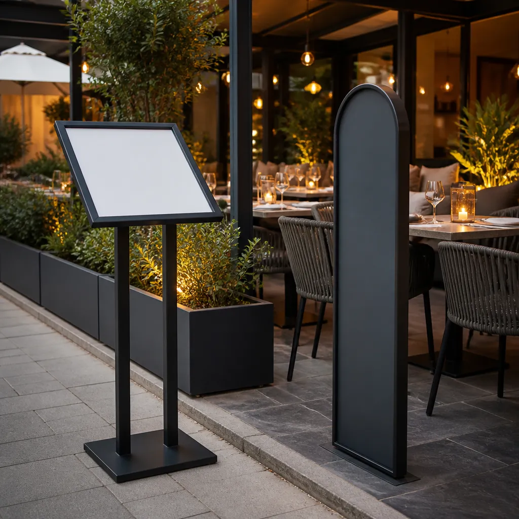
Choose the sign type based on the job first, then the finish. A pylon at the gate, channel lettering on the façade and a set of temporary displays for events each carry a different part of the brand.
| Sign Type | Best Use | Main Drawback |
|---|---|---|
| Pylon signage | Gate and road-facing identification for a property set back from the street | Usually needs structural and municipal sign-off, so it is a bigger commitment than a façade sign |
| Channel lettering | Façade branding at the hotel or restaurant entrance, visible in daylight and at night when illuminated | Fixed to the building, so a rebrand usually means new fabrication rather than a simple insert change |
| Banners, flags and A-frame displays | Events, pop-up terraces, promotions and seasonal zone markers | Exposed to weather and has a shorter life, so check them after strong wind |
Temporary zones, events and rental signage
Temporary zones need a different plan. A festival terrace, a wedding marquee or a conference pool-side bar may only run for a few weeks, and buying permanent signs for that period rarely makes sense. Rental signage lets venues keep a consistent look for events without tying up capital in fixtures that will sit in a storeroom afterwards.
The trade-off is control. Rented pieces must still match your corporate identity, so brief the supplier with logo files, colour references and approved fonts. Otherwise the temporary zone will look like a different brand from the rest of the property.
Maintenance cycles by sign type
Plan maintenance by sign type. Illuminated boxes need lamp and driver checks, banners need replacing once they fade, and façade lettering needs a cleaning cycle that stops the surface from dulling. Put the next check date on the sign register so the work does not depend on someone remembering it.
Pro tip: Ask for a material and finish sample before approving a large order, and view it at the distance and light level where guests will see it. A sample under showroom lights can look completely different at the gate at dusk.
Frequently Asked Questions
How much outdoor signage does a hotel in Gauteng actually need?
Start with the gate, the driveway decision points and the main entrance. In most cases, three or four outdoor locations give you a solid foundation, and you should add more only where guests visibly hesitate or ask for directions.
What should hospitality operators prioritise outside compared with the lobby?
Outdoor signs are read at speed, in changing light, and by people who have not decided yet. Prioritise legibility from the road or pavement first, then match the colour, typeface and sign style of the lobby so the property feels like one brand.
Can restaurant zone branding work without a full rebrand?
Yes. Add zone markers, a consistent menu board style and matching typography to the existing signs, and keep the main logo unchanged. Use the same colours and sign shapes across every zone so guests recognise the family of signs immediately.
Do South African properties need to follow ADA rules?
ADA is a US standard, so it does not set the legal requirements for a South African property. It is a useful benchmark for tactile lettering, mounting height and contrast, but confirm the local requirements with your municipality or building inspector before ordering.
How often should outdoor signs be checked?
Check illuminated signs monthly for lighting faults, inspect materials twice a year for fading or wear, and audit accessible signs after every refit or repaint. A simple register with check dates keeps this from slipping during busy seasons.
Which outdoor sign on your property do guests respond to most, and which one do they walk straight past, so we can compare notes with your own experience?
References
- Guide to using outdoor LED signage to drive restaurant traffic
- Study on how restaurant outdoor signs shape customer perceptions
- Overview of accessibility signage requirements for restaurants
- Complete guide to hospitality signage for hotels and resorts