


Parking Signage South Africa: Safety, Direction and Brand
A driver who cannot find the entrance, a delivery truck that blocks a fire lane, a bay nobody can read after dark: these are the everyday failures that parking signage South Africa businesses should be preventing. On a corporate campus, a hotel forecourt or a franchise site, the car park is the first thing a customer experiences and often the last thing anyone designs. Get it right and traffic moves, staff stop taking the blame for bad layouts, and the brand looks deliberate from the road. Get it wrong and you pay for it in incidents, complaints and a site that looks like nobody is in charge.
Table of Contents
- Quick Takeaways
- Why Forecourt Signage Carries More Weight Than You Think
- Safety Signage on Forecourts
- Directional Signage for Car Parks
- Brand Consistency Across the Car Park
- By-law and Lighting Compliance
- Choosing the Right Sign Type
- Installation and Maintenance
- Frequently Asked Questions
- References
Quick Takeaways
| Key Insight | Explanation |
|---|---|
| Get approval before you erect anything | Municipal by-laws in many areas require prior written approval before a sign is erected or placed. Check this before you order, not after the installers arrive. |
| Keep emergency access visibly clear | Fire lanes and emergency routes need signs and painted markings a driver can read at a glance. A sign hidden behind a planter does not count. |
| Put direction where drivers decide | Place arrows at the point where a driver must choose a lane or route, such as before the entry split, not at the bay itself. |
| Use one sign family across the site | Matching colours, fonts and mounting heights make a multi-site franchise look coordinated and let drivers learn the system once. |
| Check illuminated signs against traffic rules | Electronic flat signs near signalised intersections can be restricted by by-law, so confirm the distances before you specify an LED panel. |
| Design for night first | A sign that only works in daylight is unfinished. Test legibility after dark from the gate and from the road. |
Why Forecourt Signage Carries More Weight Than You Think
Most car park problems we are asked to fix start with a sign that was never ordered. The building got its fascia, the car park got a few painted bays and a boom gate, and nobody mapped how a driver moves from the road to a parking space. When people hit that gap, they stop, reverse, cut across lanes and create the exact hazards the layout was meant to prevent.

Forecourt signage does three jobs at once. It tells people where they are allowed to go, how to get there quickly, and who runs the site. Most owners budget only for the third job, which is why so many forecourts look expensive from the road and confusing from the driver's seat.
Where the first decision happens
The first decision a driver makes is usually at the kerb line, not at the bay. Entry points, split lanes and the first junction inside the property decide whether a visitor feels in control or lost. A sign that appears only after the driver is committed to the wrong lane is decoration, not direction.
In practice, we walk a site the way a stranger would. We approach from the road, stop at the gate, and note every point where a driver has to guess. Those guessing points are where the signs belong, and they are rarely the places the client expected.
Why staff end up blamed for layout problems
When a reception team fields complaints about parking, the root cause is often missing signage rather than poor service. A visitor who cannot find the right bay arrives frustrated, and the first person they meet takes the hit. Clear signs move that frustration out of the building and onto a panel that never argues back.
For corporate clients, the cost also shows up in facilities calls. The same question about where visitors park, asked every morning, is a signage failure that nobody logs but everybody feels.
Signage as a statement about the site
A forecourt that is clean, lit and consistently signed tells a visitor that someone is responsible for the place. Faded vinyl, mismatched fonts and handwritten notes tell the opposite story, whatever the building looks like. Customers form that opinion within seconds, long before they walk through the door.
Every sign on a forecourt should answer one of three questions: where do I go, how do I get there safely, and who is responsible for this place. If a sign answers none of them, it should not be on the site.
Safety Signage on Forecourts
Safety signage is the part of the job where a mistake costs the most, and it is also the part most often handled by guesswork. Public guidance on South African parking rules repeatedly stresses two points: emergency access must stay clear, and drivers should avoid parking near corners and crossings. Your signs should make both points obvious before anyone has to think about them.
Emergency access and fire lanes
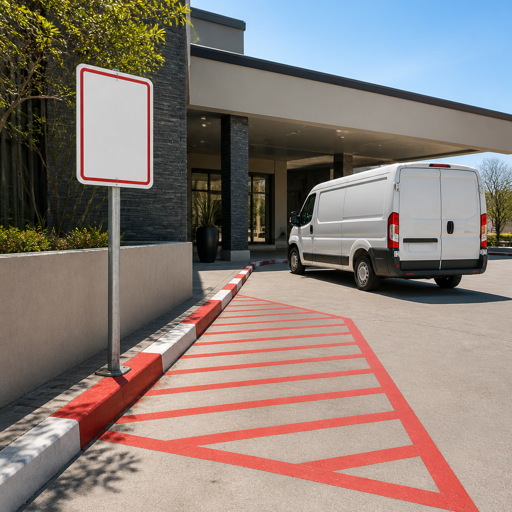
Fire lanes and emergency routes fail in a predictable way. The painted line fades, a delivery van parks across it for twenty minutes, and nobody notices because the sign is mounted too low or too far from the lane. A fire lane needs a sign that a driver sees while still able to brake, paired with ground markings that stay legible through a full rainy season.
Avoid the temptation to rely on a single sign at the entrance. Repeat the message at the lane itself, and place it where a reversing driver will look, which is often at the back of a bay rather than the front.
Pedestrian crossings and corners
Pedestrians walking between cars are the most vulnerable road users on any forecourt, and they are rarely given enough warning. Signs marking a crossing, a shopfront entrance or a corner where parking is prohibited should be placed on the approach side, not hidden on the far pillar. A driver turning into the site should see the crossing sign before the crossing comes into view.
Pro tip: Walk the site at the time of day when pedestrians are busiest, usually the lunchtime or school pick-up rush, and mark every spot where someone steps into a driving lane. Those are your priority locations, and they are often different from the spots the design drawings identified.
Reversing and speed warnings
Speed humps, pedestrian zones and reversing bays need signs that tell the driver what to do, not just what is there. A plain "speed hump" sign tells a driver nothing about how fast to go. A sign with a clear speed or a "slow down, pedestrians ahead" message does the job. Keep the wording short, use the same symbols the driver already knows from public roads, and avoid cluttering the entrance with more than two warnings at a time.
Directional Signage for Car Parks
Direction signage works when a driver can make a correct decision in a few seconds while moving. The most common failure we see is a sign that is accurate but arrives too late. The arrow is correct, the lane has already been chosen, and the driver is forced into a last-second manoeuvre that puts pedestrians and other cars at risk.
Entry, exit and one-way flow
Start with the flow of traffic, then add the signs. Mark entry and exit points clearly, and use one-way arrows that match the painted lane direction. If the site has a one-way loop, place a sign at the start of the loop and repeat it before the exit. A driver who misses the first sign should still have a second chance before committing.
Pro tip: Mount exit signs at the height and angle a driver sees when stopped at the gate, not when standing on the pavement with a clipboard. Test this from the driver's seat, because a sign that looks correct from the footpath is often hidden by a pillar or a parked van.
Bay numbering and zone labels
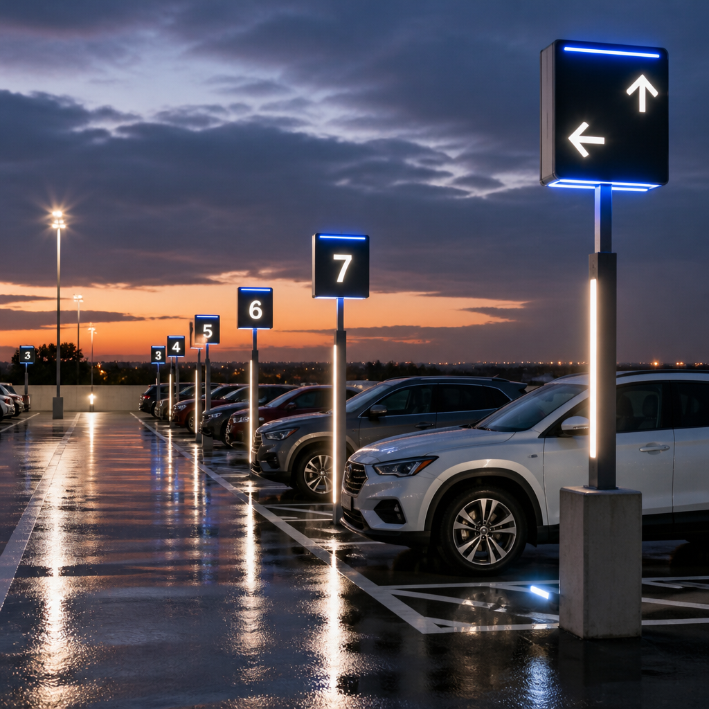
Bay numbering helps when a site has more than one car park level or several zones. Use a consistent scheme, such as a letter for each zone and a number for each bay, and show the scheme on the entry map. Visitors should be able to say "zone B, bay 14" and get to the right spot without asking anyone.
Keep zone labels simple. Reserved bays for visitors, staff and disabled users need their own signs, and each should use a clear symbol and wording that matches the site rules. Mixing reserved and general bays in the same row without clear labelling is a common source of disputes.
Height and clearance warnings
Basement and multi-level car parks need height clearance signs at the entrance and at each level change. A driver in a high-roofed vehicle, such as a delivery van or a shuttle bus, needs to know before the ramp, not halfway up it. Show the clearance figure clearly, and repeat it on the approach road if the entrance is set back from the main road.
Brand Consistency Across the Car Park
Brand is the part of forecourt signage that most owners want and least often plan for. A corporate identity manual may specify logo placement and colours for the building, but it rarely addresses how the same brand should appear on a pole, a bay marker or a gate. The result is a site that looks like three different companies designed it.
We treat the car park as part of the corporate identity, not as an afterthought. That means signs follow the same typography, colour palette and logo rules as the rest of the client's visual system, and the car park signage is approved against the same brand standards as the building.
Corporate identity standards in a car park
Ask for the brand guidelines before the design starts, and check how they handle small, outdoor and illuminated applications. Some logos work well on a fascia but lose detail at pole height, and some brand colours shift badly under LED lighting. A good identity standard specifies minimum sizes and approved colour versions for outdoor use, and a good signage partner tests those rules against the actual site.
Franchise rollouts and the one-system rule
Franchise owners face a particular challenge. Each site may have different parking layouts, landlord rules and local council requirements, but the brand must still look the same. The solution is a single sign system with defined components, such as a standard gate sign, a standard bay marker and a standard directional arrow, which can be combined differently on each site.
When a franchise rolls out new signage, keep a site register that records the sign types installed, the approval reference and the installation date. This makes it far easier to replace damaged panels with identical parts years later, instead of having a site drift into a different look.
Materials that survive weather and wear
Brand consistency falls apart quickly when materials degrade. Sun fades inks, wind loosens fixings, and car wash spray lifts vinyl edges within months. Specify materials for the environment, not for the presentation day. Aluminium composite panels, UV-stable print and stainless fixings are a sound starting point for outdoor car park signage, and any laminate should be tested for adhesion on the actual substrate.
By-law and Lighting Compliance
Compliance is where many good sign projects stall. Sign approval, illumination limits and the difference between a private sign and an official road sign all affect what you can install and where. Ignoring these rules does not make the problem go away. It usually means a notice from the municipality, a forced removal and a second installation bill.
Written approval before you erect anything
The Parking Management By-law, 2016 in the openbylaws database states that no person may, without the prior written approval of the municipality, erect or place any sign or notice in any position or place. That applies to the signage you put on a parking area, not only to the large pylon at the road. Before design, confirm which municipal department handles approval for your site and what documents it needs.
In practice, we send the drawings for approval before we order production. This avoids the common mistake of building a full sign package, then discovering that a bay marker or a pole sign needs a separate permit.
Electronic and illuminated signs near intersections
Illuminated signage needs particular care. The Outdoor Advertising By-law, 2024 published on the lawlibrary database states that electronic flat signs shall not be permitted within 80m of the perimeter of a signalised traffic intersection, except where the by-law sets out exceptions. Read the exceptions in full, because they decide whether an LED panel near a robot is allowed.
Also check brightness and movement rules. A sign that flashes or changes too quickly can distract drivers at an entrance, and the municipality may ask you to reduce its output or switch it off after certain hours.
Keeping private signs distinct from road signs
Private forecourt signs should never look like official road regulatory signs. The national transport guidance on regulatory signs sets out how official signs are built and combined, and it is a useful reference when you are deciding how a parking restriction should look. If your sign copies an official shape or colour scheme in a way that could confuse a driver, change it, even if it looks good to the client.
Choosing the Right Sign Type
Most sites need more than one sign type, and the mistakes usually come from using the wrong one for the job. A large pylon is excellent for road visibility but does nothing to guide a driver who has already entered the site. A small post-mounted sign solves the navigation problem but will not help a driver decide whether the site is worth turning into from a busy road.
The table below compares three common approaches for South African forecourts. Use it as a starting point, then test each option at the actual entry point before committing to a design.
| Sign Type | Best Use on a Forecourt | Main Trade-off |
|---|---|---|
| Pylon or freestanding sign | Identifying the site from the road and drawing traffic at the entrance | Needs structural design, planning approval and a long-term maintenance plan |
| Wall-mounted channel lettering | Building identity and signage near the main entrance or customer door | Does little for drivers navigating the car park itself, and can be hard to read from the road at speed |
| Post-mounted directional and bay signs | Guiding drivers through the site, marking zones, reserved bays and exits | Easy to knock or obscure, so placement and mounting height matter more than the design |
Pylons for visibility, post signs for navigation
A pylon earns its place when the site is set back from the road or shares a frontage with several businesses. Its job is to show the brand and the entrance from a distance. Pair it with post-mounted signs inside the site, because a driver who has turned in still needs to know which lane to take.
Post-mounted signs are the workhorse of forecourt navigation. They are cheaper to replace, easier to update when the site layout changes, and easier to fit within a standard system across a franchise.
Wall signs for the entrance and the walk
Wall-mounted lettering suits the last stretch of the journey, where a visitor has parked and is walking toward the door. It helps a visitor confirm they are in the right place. It should not be the only signage on a site, because a building face is rarely visible from the entry gate.
Installation and Maintenance
A car park sign is only as good as its last inspection. Installation sets the baseline, but the real test comes when a panel has been hit by a reversing van, a bay has been repainted, or a tenant has changed. Plan installation and maintenance together, or the site will degrade faster than the budget allows.
Schedule installation outside peak trading hours where possible. Closing a single entry lane for a morning is far easier than closing the whole forecourt for a day, and the crew can work more safely when traffic is light.
Scheduling installation around trading hours
Fit the work into the quietest window your site has, and brief the crew on traffic management before they arrive. Put out clear temporary signs, use cones that drivers can see at night, and keep a spotter at the gate when crews are working near moving vehicles. These are small steps that prevent injuries and complaints.
Pro tip: Ask for a sign-off photo from the installer showing each panel in place, the mounting heights and the distance from the entrance. Keep those photos with your approval documents, because they become your evidence if a municipal inspector or a landlord questions the layout later.
Maintenance checks that prevent faded messages
A simple quarterly walk-through catches most problems early. Look for loose fixings, cracked panels, faded arrows, blocked sightlines from trees or vehicles, and any lighting that has stopped working. Record each issue with a date and a photograph so the next visit is targeted rather than a full site inspection.
Cleaning matters too. Dirty reflective surfaces lose their effect at night, and a bay number covered in road grime is no better than a missing one.
Replacing damaged signs without breaking the system
When a sign is damaged, replace it with the same specification, not the cheapest equivalent. A mismatched replacement stands out, and drivers may read it as a different instruction. If the original design is no longer available, update the entire zone or row at once so the system stays consistent.
Frequently Asked Questions
Do I need approval before installing parking signs on my property?
In many cases, yes. The Parking Management By-law, 2016 requires prior written approval from the municipality before a sign or notice is erected or placed in a parking context. Check with your local municipal department before ordering, because the rules differ between areas and the penalty for installing without approval can be a forced removal.
What is the most common mistake in forecourt direction signage?
The most common mistake is placing signs too late. A correct arrow that appears after a driver has committed to the wrong lane forces a last-second manoeuvre. Place direction signs at the decision point, then repeat them before any second choice.
Can I use LED signs on a forecourt near a traffic light?
It depends on the distance and the local by-law. The Outdoor Advertising By-law, 2024 on the lawlibrary database restricts electronic flat signs within 80m of the perimeter of a signalised traffic intersection, subject to listed exceptions. Measure the distance from your site to the intersection and read the exceptions before you commit to an illuminated design.
How do I keep signage consistent across several franchise sites?
Create a single sign system with defined components, such as a standard gate sign, bay marker and directional arrow, and a site register that records what is installed where. Use the same typography, colours and materials everywhere, and approve local variations against the brand standard before they are installed.
How often should car park signs be inspected?
A quarterly walk-through works well for most commercial sites. Check for loose fixings, faded messages, cracked panels, blocked sightlines and failed lighting, and log each issue with a photograph so repairs can be scheduled efficiently.
What is the worst parking sign problem you have dealt with on a site you manage, and how did you solve it?