


University Signage South Africa: A Campus Wayfinding Guide
A first-year student stands outside a lecture venue with a nearly flat phone battery and no clear sign in sight. It is a familiar scene on South African campuses, and it costs more than goodwill. Missed lectures, late arrivals at tests, and visitors who decide a campus feels disorganised before they meet anyone all trace back to signage that was planned poorly. Good university signage in South Africa is not about putting up more boards. It is about deciding where people need information, in which language, and for how long it has to last. This guide sets out how we approach campus projects in Gauteng and what we would change if we were redoing a site from scratch.
Table of Contents
- Quick Takeaways
- Why Campus Wayfinding Breaks Down
- Building a Wayfinding Hierarchy That Works
- Multilingual Signage on South African Campuses
- Materials, Mounting and Durability for Campus Conditions
- Digital Signage for Changing Campus Information
- Temporary Signage for Orientation and Events
- Safety and Regulatory Signage on Campus Grounds
- Comparing Sign Types for Campus Use
- Frequently Asked Questions
- References
Quick Takeaways
| Key Insight | Explanation |
|---|---|
| Map decision points first | Place signs where a person has to choose a direction, such as junctions, lift lobbies and stair landings, not only at building entrances. |
| Name destinations the way students say them | Put the room name, the building name and the floor on one line, so students do not have to translate an internal admin code. |
| Plan a second language for high-traffic zones | South Africa has eleven official languages. Choose the languages your students and visitors read, and test the draft labels with real users. |
| Specify materials for sun, rain and tampering | UV-stable print, weather-resistant substrates and tamper-resistant fixings outlast cheap materials on exposed walkways and car park routes. |
| Use screens only for information that changes | Timetables, venue changes and emergency notices belong on screens you can update remotely. Permanent directions belong on fixed panels. |
| Build removal dates into orientation signage | Schedule temporary banners and floor graphics with a removal date, so they do not become permanent clutter after the event. |
| Keep one visual system across all buildings | Use one typeface, colour set and arrow style across every building, so the institution reads as one organisation to visitors. |
Why Campus Wayfinding Breaks Down
Most campus signage fails for a dull reason: it was designed by people who already know the site. Staff walk routes they know well, and they stop noticing gaps that a first-year will hit in the first week. The result is a campus where the main road is signed clearly, but the final stretch to the lecture hall is not.
Where students actually get lost
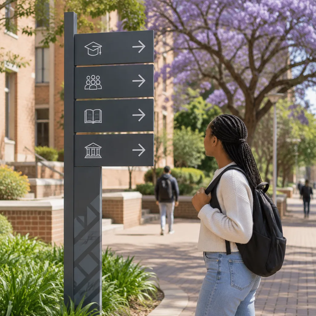
Most confusion happens at decision points, not at destinations. A student can reach the right building and still get lost if the stairwell, lift lobby and corridor all look identical and none of them names the rooms. On our site walks, we ask the client to follow a route with a timer and mark every point where someone stops, turns back or asks a question.
Visitors suffer more than students. Prospective students, parents and conference delegates arrive on a campus they have never seen, often by car, and they read signs at speed. A sign that needs several seconds of study is already too complicated for them.
What the research says about fixed signs
A 2020 study of campus wayfinding by H. Iftikhar, held in the institutional repository of the Hong Kong Polytechnic University, focused mainly on traditional information media rather than mobile wayfinding tools. That matters because fixed signage still carries most of the load for many visitors, even when students carry phones. A campus that relies only on an app leaves some people behind.
Pupnmag's article on private colleges and universities makes a related point: clear direction signs reduce stress during the first weeks of term, when people are least familiar with the layout. We treat that as the real test. A sign system should work on the first morning of orientation, not only after a semester of learning the campus.
Building a Wayfinding Hierarchy That Works
A wayfinding hierarchy tells people which signs to read first. On a campus, this usually means gateway signs at the entrance, zone signs at major junctions, and room-level signs at the final decision point. If every board carries the same visual weight, the viewer has to decide what matters, and that is where people stop reading.
Campus gateways and arrival points
Arrival signs should answer three questions: where am I, where do visitors go first, and where do I park. Keep the gateway panel to the institution name, one short directional list and a clear map reference. Anything more turns into a noticeboard that nobody can read from a moving car.
Decision points inside buildings
Place signs where a person must choose, at lift lobbies, stair landings and corridor junctions. Each sign should show only the destinations reachable from that point, with arrows that match the actual direction of travel. A sign that lists a room on the far side of the building without an arrow along the route wastes space.
A sign that answers a question nobody asked is worse than no sign at all, because it teaches people to stop reading the next one.
Naming destinations the way people use them
Use the name students use, followed by the official code. A line such as "Engineering Lecture Hall 3, Level 2" is clearer than an internal room code on its own. Test the names with people who use the building every day, because facilities teams often know buildings by old names that new students have never heard.
E-arc describes wayfinding for complex campuses in terms of clear, consistent routes for users, and that is the right test. Every sign on a route should share the same type, colour and typeface, so a visitor learns the system once and trusts it everywhere.
Pro tip: Photograph every existing sign from the point of view of someone walking, not standing. Signs that look fine from a stationary position often sit too high, too low or behind a pillar once a person is moving at normal walking pace.
Multilingual Signage on South African Campuses
South Africa has eleven official languages, and a university campus usually hosts students, staff and visitors who read different languages with different levels of confidence. Choosing the languages for signage is a policy decision as much as a design one. It should be made before the first panel goes to print, not after a complaint arrives.
Choosing the language set
Start with the languages your students actually read, based on enrolment data and the languages used in lectures and student services. Many campuses use English as the main sign language and add a second language in areas with heavy public or community traffic, such as clinics, student centres and admin counters. Do not add languages you cannot maintain, because an outdated translation looks worse than none.
A research paper on linguistic signage in higher education, indexed on ResearchGate, argues that multilingual signs have value beyond basic communication, including a role in preserving local languages. That broader view is useful when a campus council asks why a second language appears on a sign that might seem minor.
Pictograms as a second layer
Symbols help, but they do not replace words. Toilet, lift, pharmacy and accessible entrance icons are read quickly across language groups, yet room and faculty names still need text. We usually combine a small set of standard pictograms with one line of text in the primary language, and add a second language only where the traffic justifies it.
Testing labels before installation
Ask five or six students from different language backgrounds to find three destinations using only the draft signs. Note where they hesitate, then change the wording, not the people. This takes an afternoon and saves reprinting an entire floor of panels.
Pro tip: Keep a master sheet of approved room names and translations. Facilities teams change labels over time, and one source file stops a corridor from ending up with three spellings of the same venue.
Materials, Mounting and Durability for Campus Conditions
A campus sign is judged on how it looks after two years of sun, rain and dust, not on the day it goes up. Materials matter most on outdoor routes, covered walkways and car parks, where weather works on the surface every day. Specifying the right substrate at the start is far cheaper than replacing faded panels across a whole site.
Outdoor exposure and sun damage
Standard printed vinyl fades quickly under strong UV light, especially in bright colours such as yellow and red. For outdoor directional panels, use UV-stable print on a substrate that does not warp in heat. Ask suppliers for colour retention warranties and get the answer in writing.
Interior corridors can use lighter materials, but avoid high-gloss panels opposite windows. Glare can make a well-designed sign unreadable at certain times of the day.
Fixings and tamper resistance
Campus signs get knocked, stickered and sometimes removed. Use concealed or tamper-resistant fixings for panels at head height, and avoid loose elements such as hanging plates that can be turned or taken. A sign still on the wall years later is usually one that was mounted with misuse in mind.
Lighting for evening routes
Night routes need a different approach. Backlit or edge-lit signs can help students find buildings after dark, but they must sit where power is reliable and maintenance teams can reach them. A dead light panel on a poorly lit path is worse than no panel, because it implies a route is marked when it is not. Our custom signs range covers illuminated options, and we advise clients on which routes justify lighting.
Digital Signage for Changing Campus Information
Digital screens earn their place when information changes faster than a printed panel can be replaced. Timetable changes, venue swaps, event schedules and emergency notices fit that description. Permanent directions do not, because they should not need updating every week.
Emergency and safety notices
Pupnmag's article on private institutions notes that digital displays can broadcast urgent information quickly to a campus community. In practice, that only works if the screens run on a managed content system and someone is responsible for publishing messages. Prepare message templates before an emergency, including who can authorise an override and which screens it reaches.
Timetable and event updates
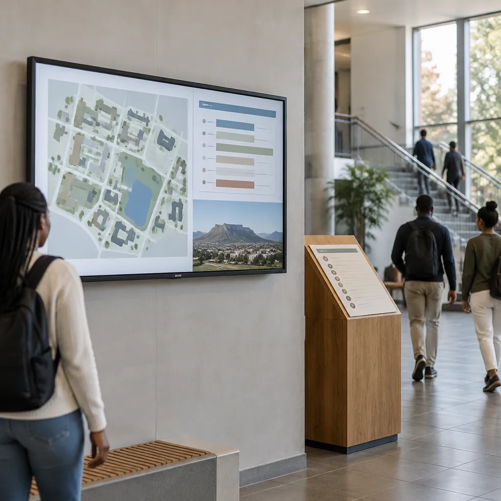
Screens near lecture theatre clusters can show the next session in each venue, along with room changes and cancellations. This reduces the number of students waiting in a corridor for a room that has already moved. Keep the layout simple, with large text and no more than one or two messages per rotation, because passing students read for seconds.
Where screens fail
Screens fail when they sit in glare, when they show out-of-date content for weeks, or when they try to do everything at once. A long slideshow loop is unreadable from a corridor. Specify a screen only when someone has the job of managing it. If you want to trial a screen before committing, our digital signage rental page is a practical place to start.
Pro tip: Run a screen for two weeks with a single timetable message before adding anything else. If students still crowd the screen to read the timetable, the font size or placement is wrong, not the idea.
Temporary Signage for Orientation and Events
Orientation week is the one period when a campus must guide large numbers of new people through unfamiliar buildings in a short window. Temporary signage makes that manageable, but it is also where good intentions turn into clutter. Plan the temporary layer as carefully as the permanent one.
Planning orientation routes
Map the first-day route for new students, parents and staff before ordering anything. Use banners, floor graphics and A-frame boards only where permanent signs are missing or hidden, such as registration tents or shuttle drop-off points. Keep colour and typeface consistent with the permanent system, so students do not learn two visual languages in one week.
Removal and storage after the event
Write the removal date on the planning sheet, and assign one person to collect every temporary item. Floor graphics left behind after the event become trip hazards and signal that nobody is looking after the building. Store banners and flags in labelled sleeves, because a well-kept banner is far cheaper to reuse than a replacement printed for the next intake.
Safety and Regulatory Signage on Campus Grounds
Directional signs help people find their way, while safety and regulatory signs tell them what they must or must not do. Campuses carry a mix of fire routes, laboratory hazards, parking rules and road markers, and each category has its own visual conventions. Mixing them up or hanging them in the wrong place weakens trust in the whole sign system.
Mandatory and prohibitory signs in labs and workshops
Mandatory signs, such as those requiring eye protection or protective footwear, belong at the entrance to a workshop or lab, not only inside where people have already walked past them. Prohibitory signs, such as no smoking or no food, should sit at the entrance and be repeated where the risk is highest. Our range includes both categories, so check which ones your buildings already have before ordering, through our mandatory signs and prohibitory signs pages.
Warning and road signs on campus roads
Campus roads often carry pedestrians, cyclists and delivery vehicles on the same surface. Warning signs for speed humps, pedestrian crossings and loading zones should be placed before the hazard, with enough distance for a driver to react. Road markers should follow the conventions your municipality applies, so confirm those before you order.
Pro tip: Place safety signs against a risk register, not against the architectural drawing. Ask who uses each route at night, in rain and during events, and place the sign where the decision is made, not where the plan shows a door.
Comparing Sign Types for Campus Use
Most campuses need three types of signage, but the mix should follow how long the information lasts. Each type has a clear job and a predictable failure mode. The table below sets them side by side.
| Sign type | Best use on campus | Main weakness |
|---|---|---|
| Fixed directional panels in aluminium or acrylic | Permanent routes, building entrances and decision points | Slow to update when rooms or departments move |
| Digital screens | Timetables, event notices and emergency messages | Need content management and power, and can fail without anyone noticing |
| Temporary banners and floor graphics | Orientation weeks, registration and short events | Damage easily and clutter the site if they are not removed on time |
If the information changes less than once a year, fix it in metal, acrylic or durable vinyl. If it changes weekly, put it on a screen or on a replaceable insert. Temporary products should be the exception, not the default, because a campus that relies on banners for permanent guidance is always one storm away from a mess.
Our signage range covers all three categories, and we recommend a site survey before choosing between them. A survey shows where people stop, where they turn back and which signs are missing, which is far more useful than a catalogue.
Frequently Asked Questions
How much does university signage cost in South Africa?
Cost depends on the number of panels, the materials, installation access and whether signs are illuminated. We price each project after a site survey, so call 010 500 7667 for a quote based on your actual scope.
Do South African universities need signs in more than one language?
Not every sign, but most campuses benefit from a second language in high-traffic areas such as student services, clinics and admin counters. Base the choice on the languages your students and visitors read, and keep translations under version control.
How often should campus signage be audited?
Walk the main routes at least once a year, and again after any refurbishment or department move. Look for damaged panels, outdated room names and signs blocked by new fittings or vegetation.
Can digital screens replace printed directional signs?
No. Screens suit information that changes often, such as timetables and emergency notices. Permanent routes are clearer on fixed panels that do not depend on power, software or a working network connection.
How far ahead should orientation signage be planned?
Plan the route and quantities several weeks before orientation, because production and installation take time. Set the removal date in the same planning sheet, so temporary signs do not outlive the event.
Should campus signage follow corporate identity standards?
Yes. A consistent typeface, colour palette and sign hierarchy across buildings makes an institution look organised and helps visitors trust the system. We apply the same discipline to corporate and franchise projects.
Tell us which sign on your campus causes the most confusion and what you would change first.
References
- Article on clear direction signs and digital signage for private colleges and universities
- Guide to real-world digital signage applications in higher education
- Empirical study of linguistic signage in a linguistically diverse higher education setting
- 2020 study on the efficacy of traditional campus wayfinding signage
- Overview of wayfinding signage for complex campus navigation