


Cut-Out vs Channel Letters: South African Shopfront Guide
Walk down any busy commercial strip in Gauteng and you will notice that two types of three-dimensional lettering dominate shopfronts: flat cut-out letters mounted flush or on standoffs, and fabricated channel letters that glow from within. Business owners regularly confuse the two, or assume they are interchangeable, and then discover mid-installation that the choice has downstream effects on budget, municipal by-law compliance, electricity consumption, and the way a brand reads from the road. This guide breaks down exactly what each option is, where each one wins, and how to decide which format suits your shopfront in South Africa.
Table of Contents
- Quick Takeaways
- What Are Cut-Out Letters?
- What Are Channel Letters?
- Cut-Out vs Channel Letters: A Direct Comparison
- Illumination Options Explained
- Which Signage Type Suits Your Business?
- Corporate Identity and Franchise Considerations
- Frequently Asked Questions
- References
Quick Takeaways
| Key Insight | Explanation |
|---|---|
| Cut-out letters are flat and non-illuminated by default | They are laser-cut or CNC-routed from acrylic, aluminium, or stainless steel sheet and can be painted to any brand colour, but they do not have internal lighting unless specifically designed as backlit or edge-lit variants. |
| Channel letters are three-dimensional and built for illumination | Each letter is individually fabricated with a metal return (side wall), a face (usually acrylic), and an LED module inside, creating depth and nighttime visibility that flat cut-out letters cannot match without additional lighting infrastructure. |
| Cost difference is real but not always the deciding factor | Cut-out letters generally carry a lower upfront cost because they require less fabrication. Channel letters involve more components and skilled assembly, but their longevity and LED efficiency can reduce total cost of ownership over several years. |
| Front-lit and halo-lit channel letters serve different brand personalities | Front-lit letters push bold, high-visibility light outward, ideal for high-traffic retail. Halo-lit letters cast a soft glow behind the letter, creating a premium, architectural feel suited to hotels, boutiques, and professional services. |
| Material choice affects durability in South Africa's climate | Gauteng's UV intensity and occasional hailstorms are harsh on signage. Powder-coated aluminium outperforms raw acrylic for exterior cut-out letters, while quality channel letter builds use marine-grade aluminium for the body. |
| Franchise and CI compliance often dictates the format | Many franchise agreements and corporate identity (CI) manuals specify letter type, depth, font, colour, and illumination method. Deviating from these specs can result in costly remakes and CI audits. |
| Installation requirements differ significantly | Cut-out letters can often be installed with VHB tape, standoff pins, or threaded rods. Channel letters require electrical routing to the sign face, which adds installation time and may require a qualified electrician under South African regulations. |
What Are Cut-Out Letters?
Cut-out letters (also called flat-cut letters, laser-cut letters, or CNC-routed letters) are individual characters cut from a solid sheet of material. Common materials include acrylic (Perspex), aluminium, stainless steel, mild steel, and PVC. The shape of each character is determined by a computer-driven laser or CNC router, which means the precision is consistent across an entire set of letters, even in complex or custom fonts.
Once cut, the letters are typically painted, powder-coated, brushed, or left with a raw metallic finish. They are then mounted directly onto a fascia board, a wall surface, or raised on standoff pins to create a floating shadow effect. The shadow-mount technique adds a small but effective illusion of depth without any electrical components.
When are cut-out letters used in South Africa?
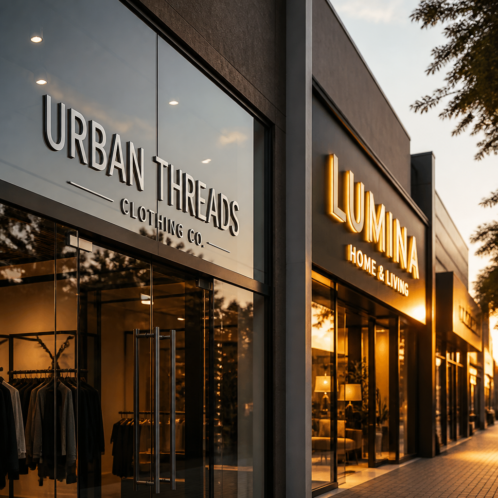
Cut-out letters are widely used across retail stores, office receptions, hotel lobbies, salon shopfronts, and restaurant entrances throughout Gauteng and the broader South African market. They are the practical choice when a business trades during daylight hours, operates in a heritage or mixed-use zone with restrictions on illuminated signage, or simply needs a clean, minimal shopfront aesthetic without the infrastructure of electrical wiring.
For businesses in a shopping centre environment where ambient lighting at night is already strong, non-illuminated cut-out letters in stainless steel or powder-coated aluminium can read just as well after dark as a fully lit channel letter sign, at a fraction of the cost.
Pro tip: If your landlord or municipality prohibits illuminated external signage, specify aluminium or stainless steel cut-out letters on standoff pins with a recessed LED strip concealed in the fascia board. You get visible depth and soft ambient uplighting without technically illuminating the letters themselves.
What Are Channel Letters?
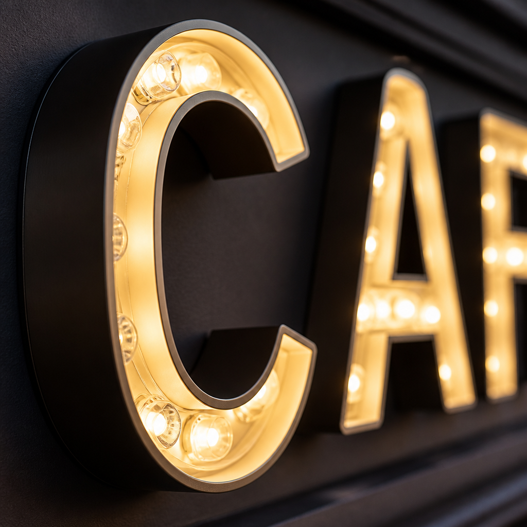
Channel letters are three-dimensional, individually fabricated signage elements. Each letter is built like a shallow box: a metal return (the side wall, typically aluminium) forms the depth of the letter, a translucent acrylic face sits at the front, and an LED module is mounted inside. The result is a letter that glows, stands proud from the building surface, and reads clearly both day and night.
The term "channel" refers to the channel-shaped cross section of each letter when viewed from the side. Modern fabrication uses automated aluminium bending machines to form the returns, which speeds up production and improves the consistency of curves and complex letterforms. Once the returns are bent and welded, the LED strips are installed, power supplies are wired, and the acrylic face is clipped or bonded in place.
Front-lit channel letters
Front-lit (face-lit) channel letters are the most common format on South African high streets and shopping centre pylon signage. The LEDs sit behind the acrylic face, pushing light forward. This creates maximum daytime contrast and strong nighttime visibility from a distance, making them the default recommendation for high-traffic road-facing shopfronts where read distance matters.
Halo-lit channel letters
Halo-lit letters (also called backlit or reverse-lit channel letters) have the LEDs facing the wall surface rather than the front face. The letter body itself is solid, usually brushed aluminium or painted metal, and a soft halo of light glows behind the letter against the wall. The effect is subtle and sophisticated. It suits luxury retail, boutique hotels, law firms, and financial services practices where the brand should feel premium rather than loud.
A well-specified channel letter sign is an asset that works 12 hours a day, 365 days a year, at roughly the energy draw of a household LED bulb per letter. The question is never whether channel letters are worth it, but whether the specific format matches the brand's visual language.
Cut-Out vs Channel Letters: A Direct Comparison
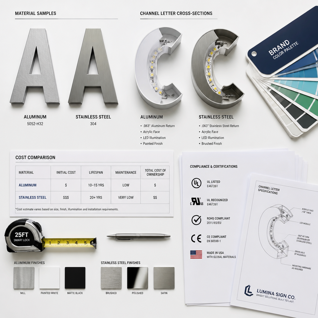
The table below compares the three most commonly specified shopfront letter formats in South Africa: standard flat cut-out letters, front-lit channel letters, and halo-lit channel letters. Use this as a starting framework, not a final specification. Every shopfront has variables including wall material, available power supply, landlord restrictions, and CI requirements that affect the final recommendation.
| Feature | Flat Cut-Out Letters | Front-Lit Channel Letters | Halo-Lit Channel Letters |
|---|---|---|---|
| Illumination | None (or optional edge/backlit variant) | Internal LED, light projects forward | Internal LED, light projects onto wall behind |
| Depth / 3D Effect | Minimal (shadow if standoff-mounted) | Strong, 50mm to 200mm+ depth | Strong, with added halo glow |
| Nighttime Visibility | Low unless ambient lighting assists | High, reads clearly at distance | Medium, refined rather than bold |
| Typical Materials | Acrylic, aluminium, stainless steel | Aluminium return, acrylic face, LED module | Aluminium return, solid face, LED module |
| Relative Cost | Lower upfront | Medium to high | Medium to high |
| Installation Complexity | Low, mechanical fixing only | Medium, requires electrical connection | Medium to high, precise standoff gap required |
| Best For | Indoor reception, heritage zones, budget-conscious shopfronts | High-street retail, franchise fascias, road-facing signage | Luxury retail, hotels, boutique hospitality, corporate offices |
| Maintenance | Very low, no electrical components | Low, LED modules have long lifespan | Slightly higher, full letter removal needed to service wiring |
A common mistake is choosing cut-out letters for a road-facing shopfront that has no street-level ambient lighting, then discovering six months later that the sign is essentially invisible after 5pm. If your business is open in the evenings or if foot traffic passes after dark, illumination is not optional. It is a basic function of the sign.
Illumination Options Explained
South African business owners often encounter confusing terminology when briefing a signage supplier. The following breakdown covers the illumination formats most relevant to shopfront lettering decisions.
LED channel letters vs. neon channel letters
Older channel letter signs used neon tubes as the light source. Neon produces a warm, distinctive glow and remains popular for aesthetic reasons in hospitality and entertainment venues. However, LED channel letters now dominate commercial shopfront signage because they consume significantly less electricity, are more resistant to vibration and physical shock during installation, and have longer operational lifespans. In South Africa, where load-shedding puts additional strain on electrical infrastructure, the lower wattage draw of LED-lit signage is a practical advantage.
Backlit cut-out letters
A hybrid option that bridges the two formats is the backlit cut-out letter. Here, letters are cut from an opaque material, mounted onto a light box or an illuminated fascia panel, and the light source sits behind the letter, causing the panel or halo to glow around the letter shape. This is different from a channel letter because the letter itself has no internal components. It is different from a standard cut-out letter because it requires a powered lightbox as the substrate. This format is common on shopping centre pylon directories and indoor directional signage.
Edge-lit acrylic letters
Edge-lit acrylic is a third option, particularly popular for reception signage and indoor brand walls. Light enters the acrylic sheet from its edge and is guided through the material to illuminate the letter shape. The effect is clean and modern, and the installation is relatively simple. Edge-lit acrylic letters are generally not suitable for exterior use in South Africa because moisture ingress and UV exposure degrade the light-guiding properties of the acrylic over time.
Pro tip: When specifying any illuminated shopfront letter for a South African exterior installation, insist on an IP65 or higher ingress protection rating on the LED driver and wiring connections. Gauteng thunderstorms push water into joints that appear sealed under normal conditions.
Which Signage Type Suits Your Business?
The right choice depends on three things: where the sign will be viewed from, what hours your business operates, and what your brand should communicate at first glance. These questions are more useful than asking "what is cheaper" because the cheaper option installed in the wrong application will need to be replaced sooner.
Retail shops and restaurants
Retail shops, restaurants, and takeaway outlets in high-visibility positions on main roads benefit most from front-lit channel letters. The bold illumination competes with surrounding signage and vehicle headlights after dark. For restaurants operating from late afternoon into the evening, the cost difference between channel letters and cut-out letters becomes irrelevant measured against the customer walk-ins generated by a visible sign at night.
Hotels and boutique hospitality
Hotels, guesthouses, and boutique accommodation properties typically want signage that communicates quality without shouting. Halo-lit channel letters in brushed stainless steel or painted aluminium project a premium look that is legible without being aggressive. Cut-out letters in stainless steel with proper wall lighting are also a strong option for hospitality properties where the architectural finish is a key part of the brand.
Corporate offices and professional services
Law firms, financial advisors, medical practices, and corporate campuses often use cut-out letters for their reception walls and building entrance signs. The absence of illumination reads as intentional restraint. Stainless steel or polished aluminium letters on standoff pins in a reception lobby create an authoritative, clean impression without the visual noise of a glowing sign. For the exterior building identification sign, however, front-lit or halo-lit channel letters remain the more practical choice if night visibility matters.
Fitness centres and gyms
Fitness centres often trade across long operating hours, from early morning to late evening. Front-lit channel letters on the fascia make practical sense. Bold, high-contrast illumination communicates energy and accessibility. Many fitness brands also have strict CI specifications that mandate channel letter formats, colours, and return depths, so the choice may already be made for you by the franchisor.
Corporate Identity and Franchise Considerations
For franchise owners and corporate rollout projects, the choice between cut-out letters and channel letters is rarely a free decision. Corporate identity (CI) manuals typically specify letter format, material, depth, font, colour reference, and in many cases the exact supplier or fabrication method. Deviating from these specifications, even with good intentions, can result in a failed CI audit, required replacements at the franchisee's expense, and brand inconsistency across the network.
In practice, franchise signage briefs almost always specify channel letters for external shopfronts because the illuminated format delivers consistent brand visibility across different locations, different ambient lighting conditions, and different times of day. Cut-out letters appear more often in franchise CI for internal applications such as reception walls, behind-counter branding, and training room signage, where control over the environment is greater.
A common mistake franchise owners make is sourcing signage locally from a supplier who is unfamiliar with the CI manual, resulting in letters that are the right colour but wrong depth, or the right font but wrong material finish. Any supplier handling franchise or corporate rollout signage needs to read and follow the CI document precisely, and should be willing to provide a physical sample or a prototype letter before committing to a full production run.
SignShopper works specifically with corporate clients and franchise networks where CI adherence is non-negotiable. If you are rolling out signage across multiple locations in Gauteng or elsewhere in South Africa, having a single supplier manage production, quality control, and installation across all sites reduces the risk of inconsistency and the administrative burden of managing multiple contractors. Explore channel lettering options or view cut-out letter specifications to start a conversation about your requirements.
Frequently Asked Questions
What is the main structural difference between cut-out letters and channel letters?
Cut-out letters are flat characters cut from a single sheet of material, such as acrylic or aluminium, and mounted onto a surface. Channel letters are three-dimensional fabricated structures where each letter has a depth dimension, formed by bending a metal return (side wall), capping it with an acrylic face, and typically housing an LED light source inside. Channel letters are built, cut-out letters are cut.
Can cut-out letters be illuminated?
Yes, cut-out letters can be specified with illumination in two main ways. Backlit cut-out letters are mounted onto an illuminated panel or lightbox so that light glows from behind the letter. Edge-lit acrylic letters use the acrylic sheet itself to guide light from an LED strip concealed at the edge. Neither format provides the same depth or street-level visibility as a true channel letter, but both are valid solutions for specific environments such as indoor receptions or sheltered fascias.
Which option is more suitable for a South African outdoor shopfront that trades in the evenings?
Front-lit channel letters are the stronger recommendation for any business open after dark with an external shopfront visible from the road. They provide self-contained illumination that does not depend on ambient street lighting, they are legible from a greater distance, and modern LED channel letters are energy efficient enough that running costs are manageable even during periods of load-shedding when a generator or inverter carries the load.
How do I know which format my franchise agreement requires?
Check your franchise agreement and the accompanying corporate identity manual. These documents typically specify letter type, depth, font, colour reference (often a Pantone or RAL code), material, illumination format, and mounting method. If the CI manual is ambiguous or outdated, escalate the question to your franchisor's marketing or operations team before commissioning any signage, because replacement is costly and the franchisor is unlikely to share that cost if the deviation was not pre-approved.
What materials work best for cut-out letters on an exterior South African shopfront?
Powder-coated aluminium is the most durable and practical material for exterior cut-out letters in South Africa. It resists UV fading, handles temperature variation well, and does not corrode in the way mild steel does when the protective coating is scratched. Stainless steel is a premium alternative with excellent corrosion resistance and a distinctive brushed or mirror finish. Standard acrylic (Perspex) cut-out letters can be used outdoors but should include UV-inhibiting additives in the material specification, and they are more susceptible to impact damage from hail in Gauteng.
Is there a meaningful energy cost difference between channel letters and a lit cut-out letter panel?
The comparison depends on the specific configuration, but individual LED channel letters are generally very efficient because the LED module illuminates only the letter body rather than a large panel area. A backlit lightbox panel that illuminates around cut-out letter shapes uses a continuous light source across the full panel, which can draw more power for a similar visual effect. For large-format signage, channel letters often have the energy advantage. For smaller shopfront applications, the difference is unlikely to be a significant operational cost factor.
Have you recently replaced or specified shopfront lettering for your South African business? Share what worked well and what you would do differently below.
References
- SignShopper product page on cut-out letter signage options for South African shopfronts
- Technical comparison of front-lit and halo-lit channel letter signage formats
- Guide to LED channel letter illumination types and their visual effects
- Overview of LED illuminated sign and letter options available in South Africa
- 3D channel letter signage specifications and applications across Gauteng