


Beauty Salon Signage South Africa: Signs That Win Bookings
A client decides whether to walk into a beauty salon or spa in the few seconds it takes to read the fascia, glance through the window and find the door. For most salons across Gauteng, that decision is made before a receptionist says a word. Beauty salon signage in South Africa is therefore a booking tool, not decoration. This guide covers what works on the street, at the entrance and inside the reception area, and where owners usually waste their budget. The advice comes from the signage work we do for salons, spas and wellness brands, and it focuses on the choices that change whether a passer-by becomes a client.
Table of Contents
- Quick Takeaways
- First Impressions Start Outside the Door
- Fascia and Shop Front Signs That Get Read From the Pavement
- Window Graphics and Entrance Signage
- Menus and Price Boards That Answer the First Question
- Choosing Between LED, Neon and Cut-Out Letters
- Wellness Branding Without Generic Imagery
- Franchise Identity for Multi-Site Salons and Spas
- Frequently Asked Questions
- References
Quick Takeaways
| Key Insight | Explanation |
|---|---|
| Test the fascia from across the road | Walk to the far side of the pavement, then drive past at normal speed. If the business name and service line are not readable from both, the sign is failing before the client reaches the door. |
| Name the treatment, not just the brand | "Brow and Lash Studio" or "Day Spa and Massage" tells a passer-by what they can book. A vague name forces them to guess, and most people do not stop to guess. |
| Put the menu where the decision happens | A menu board visible from the entrance answers the first question clients ask and filters out enquiries you cannot serve, which saves reception time. |
| Use window graphics for privacy, not coverage | Frosting the lower half of the glass hides treatment beds while keeping daylight, the reception desk and the opening hours visible from the street. |
| Make the sign promise something the team can deliver | Calm, premium branding fails when the reception area is loud and rushed. Clients judge the brand by what they see at the desk, so the sign and the staff must describe the same experience. |
| Standardise colours and type across every site | Multi-branch owners lose trust when each branch looks different. Agree a one-page sign standard before the first sign is ordered, and give it to every landlord and installer. |
| Confirm approvals and power before choosing LED | Illuminated and projecting signs often need municipal approval and a dependable electrical supply. Check both before you commit to backlit lettering, because a dark fascia costs you evening bookings. |
First Impressions Start Outside the Door
Most salon clients do not arrive with a plan to book. They drive past, walk past or notice a shop front while waiting for a lift, and they decide within seconds whether the place looks like somewhere they would trust with their hair, skin or body. That judgment happens on the pavement, long before any treatment is discussed.
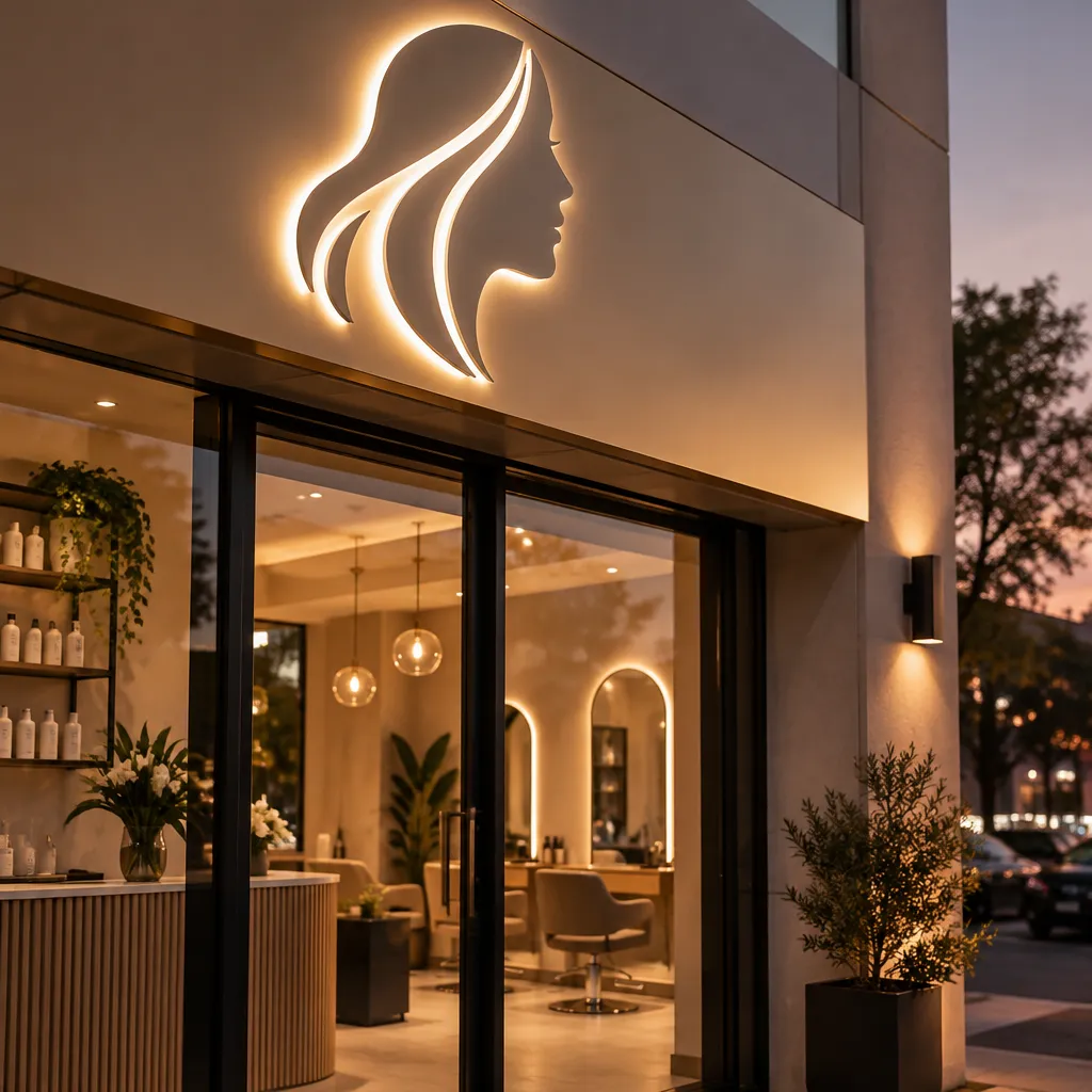
Research on salon customers links brand image and customer experience to purchase intention, which is a useful frame for signage. The sign is the first part of the brand experience a client can assess, and it sets expectations for everything that follows.
What a Passer-By Actually Reads
A passer-by reads three things: the name, the type of service and whether the place looks open. If your sign shows only a logo and a script font, you have asked a stranger to guess what you sell. Put the service in plain words beside or below the name, even if the logo remains the dominant element.
In practice, many salon fascias fail the walking test. The business name is legible from a car, but the sign disappears against a busy facade at pedestrian distance, and that is where most local clients see it.
Why the Look Has to Match the Price
A premium day spa with a hand-painted fascia and a flimsy box sign at the entrance sends two contradictory messages. Clients treat the sign as a preview of the treatment room, so every material should sit at the same standard. A mid-range salon can look modern and clean without looking expensive, but it cannot look cheap and still expect clients to pay for a signature massage.
Fascia and Shop Front Signs That Get Read From the Pavement
The fascia is the largest advertisement most salons will ever own, and it is often the most poorly planned. Owners frequently choose the sign after the lease is signed, measure the space the landlord allows, and fill it with the name in the biggest font that fits. That approach gives the most valuable real estate on the building to the least useful information.
A fascia should answer the question a client asks from across the road. That usually means a clear business name, a short service line and, where it helps, a visible contact method.
Lettering Height and Viewing Distance
Choose letter height from the furthest point where a client can reasonably see the sign, not from the middle of the shop front. Test it on foot from across the road, then from a car at normal speed. If you can read the sign only while standing directly in front of it, the lettering is too small or the contrast is too weak.
A sign does not sell the treatment. It sells the reason to walk through the door and the confidence to book.
Illuminated Versus Non-Illuminated Fascias
Backlit or channel-lit lettering works well for evening trade, especially in shopping centres and on busy roads where salons compete for attention with restaurants and fitness studios. It also brings power planning into the decision. Confirm your electrical supply and back-up arrangements before you commit, because a dark fascia after sunset does more damage than a simpler sign that reads well in daylight.
Many municipalities require approval for illuminated, projecting or large signs, and requirements differ from one council to the next. Check the local by-laws for your site before fabrication starts, because a sign that has to be removed after installation is an expensive lesson.
Pro tip: Print the fascia design at full scale on paper, tape it to the wall where the sign will go, and then walk to the far end of the pavement and look back. If you cannot read the service line from there, it needs more weight, more contrast or a cleaner layout.
Window Graphics and Entrance Signage
The window is where a salon either invites clients in or intimidates them. Clients want to see that the space is clean and welcoming, but many also feel uneasy about looking into a treatment room in full view of the street. Window graphics solve both problems when they are designed as privacy with purpose, not as a wall of stickers.
Frosting That Keeps Daylight Inside
Partial frosting or a band of opaque film across the lower part of the glass keeps treatment beds out of sight while letting natural light into reception. Full-coverage film makes a spa look closed during the day, which is when most people walk past. Keep the top of the glass clear so the reception desk and the interior remain visible.
Frosted panels also need to match the rest of the brand. A pattern that looks charming on a mock-up can read as clutter in a real window, so approve the finished glass in daylight before the film is applied.
Door Hardware and Opening Hours
The door is the one place where the client must make a physical decision. Place opening hours, the booking method and a clear push or pull instruction at eye level on the glass. Nothing loses walk-in clients faster than a door that confuses them, and a printed booking route on the door often does more work than another logo.
If your salon wants to show hygiene standards, a discreet sanitiser station with a short instruction sign near the entrance reassures clients. You can specify it alongside the entrance graphics through our sanitizer range.
Menus and Price Boards That Answer the First Question
Most clients who hesitate outside a salon are asking one question: is this place for me? A menu board visible from the entrance answers it faster than any slogan. It also screens out enquiries you cannot serve, which protects reception time for the clients you want.
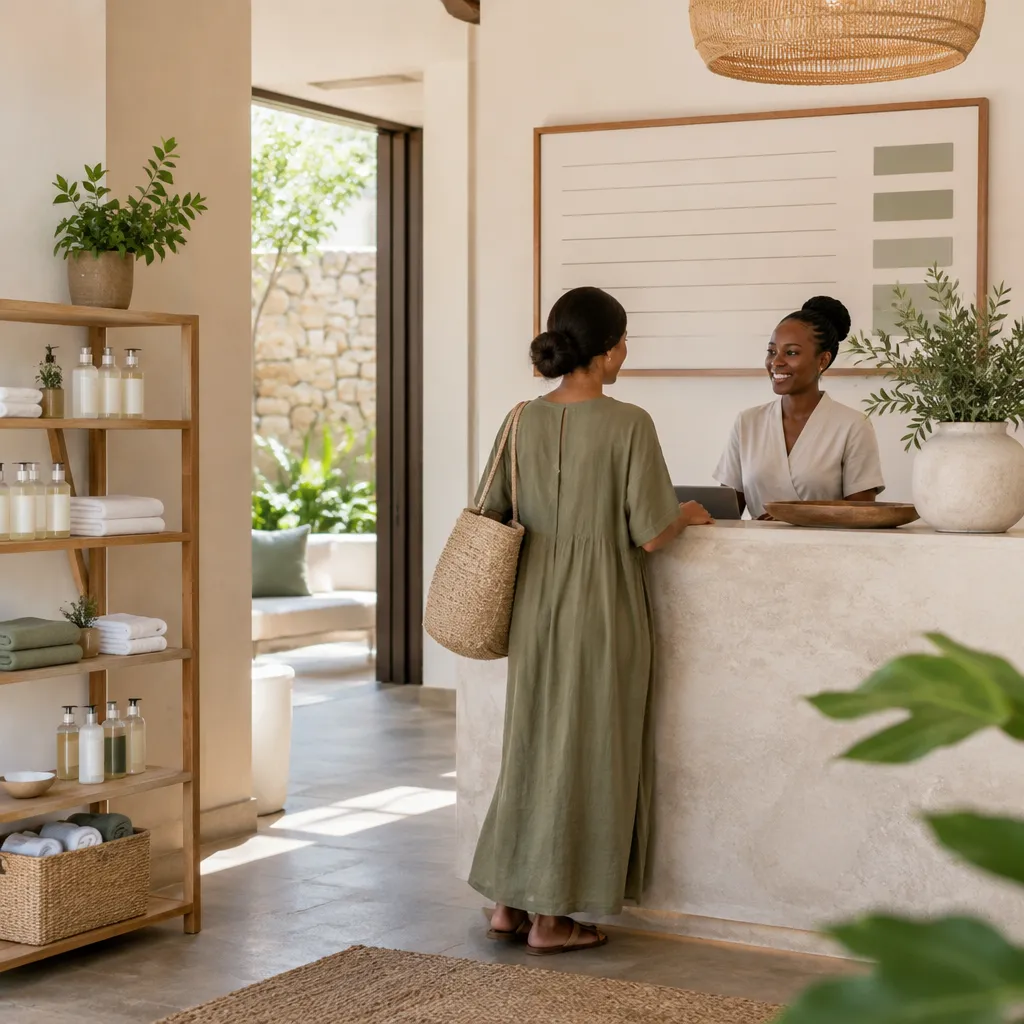
Keep the Menu Short Enough to Scan in Passing
Trim the board to the services you want to be known for. A long list of every treatment in small print reads as indecisive. Group treatments by category, use the same wording as your booking system, and remove discontinued services before the board goes up.
Use the menu to tell clients what the room is like. A line such as "Hot stone and aromatherapy, 90 minute suite" gives a sense of the experience, while "Massage" alone gives nothing to compare against other options in the street.
Materials That Survive Sun, Dust and Humidity
Menus near a street-facing door fade quickly in Gauteng sun. Steam rooms and wet treatment areas are harder on paper than on acrylic or laminated print. Choose a material suited to its position, and plan for updates from the start.
A board you cannot change easily will show old prices within months, and out-of-date prices damage trust faster than having no board at all. Digital screens suit salons whose promotions change often, although a printed board is still the better choice for a fixed menu in a small space.
Pro tip: Use identical service names on the menu board, the website and the booking app. A client who sees "Deep Tissue Massage" on the board and "Sports Massage" online will ask whether they are the same treatment, and a slow reply can cost you the booking.
Choosing Between LED, Neon and Cut-Out Letters
Three sign types cover most of what salons and spas ask us for, and each suits a different brand position. The choice depends less on which option looks best in a mock-up and more on where the sign is viewed, how many hours it runs and how the brand is expected to age.
LED backlit lettering suits the high-traffic entrance of a multi-service salon, where legibility after dark matters most. Neon works for a boutique brand that wants a warm, personal feel, but it is a statement piece and should be used sparingly. Cut-out letters on a non-illuminated fascia suit clinical, minimalist or aesthetic-led brands, and they age well when the fixings are sound.
| Option | Best Fit | Common Mistake |
|---|---|---|
| LED backlit channel lettering | Multi-service salons and spas on busy roads with strong evening trade | Choosing a bright white face that washes out the brand colour in daylight |
| Neon signs | Boutique studios and day spas with a strong personal brand | Adding neon to every wall until the interior looks like a bar |
| Cut-out letters on a non-illuminated fascia | Clinical, minimalist and aesthetic-led brands that want a calm look | Using thin letters that disappear against textured cladding or a busy facade |
Plan for the Brand's Lifespan
Ask how long the brand will stay as it is. If a franchise may change its name or service line within a few years, cut-out letters that can be swapped are more practical than a neon tube that has to be rebuilt. For a brand that expects to keep its identity for many years, invest in the material that looks right in both daylight and darkness.
If your reception area needs rotating service information, a screen can replace some printed boards. Our digital signage range covers this option, and it works best when the content is updated from a single source.
Wellness Branding Without Generic Imagery
Spa and wellness brands lean heavily on the same visual shorthand: pale greens, stones, lotus flowers and serif fonts with generous letter spacing. Clients see it so often that it stops registering. A sign that could belong to any spa in the country does nothing to justify a higher price or a second visit.
Wellness branding works when it is specific. The sign should tell the client what the experience is, not just how calm the brand wants to feel.
Let the Treatment Name Do the Differentiating
Specific names do more work than generic calm imagery. "Hot stone and aromatherapy suite" says more than "Serenity." Write the sign copy from your treatment list first, then choose the visual style that suits those treatments.
Keep the wording short enough to read in a few seconds. If the sign needs a paragraph to explain the brand, the brand is not yet clear enough for the street.
Sensory Cues Beyond the Logo
Research on beauty spa centres has linked sensory experience with customer satisfaction and loyalty, so signage that signals what the room will feel like can set useful expectations. A warm rather than harsh light, a matte finish that avoids glare into reception and a small plaque naming the therapist all make the brand feel like an experience rather than a decoration.
Expectations must also match the team. A South African study of customer experience at hair salons and spas points to owners shaping perception through skilled staff and good time management. A sign that promises a relaxed, unhurried visit will fail on a busy Saturday if the desk is understaffed, so promise only what the team can deliver at peak times.
Franchise Identity for Multi-Site Salons and Spas
Franchise owners and multi-site spa operators face a different signage problem. Each branch may be built by a different landlord, approved by a different council and fitted to a different shop front, yet clients expect the same brand experience at every site. Inconsistency reads as unreliability before a single treatment has started.
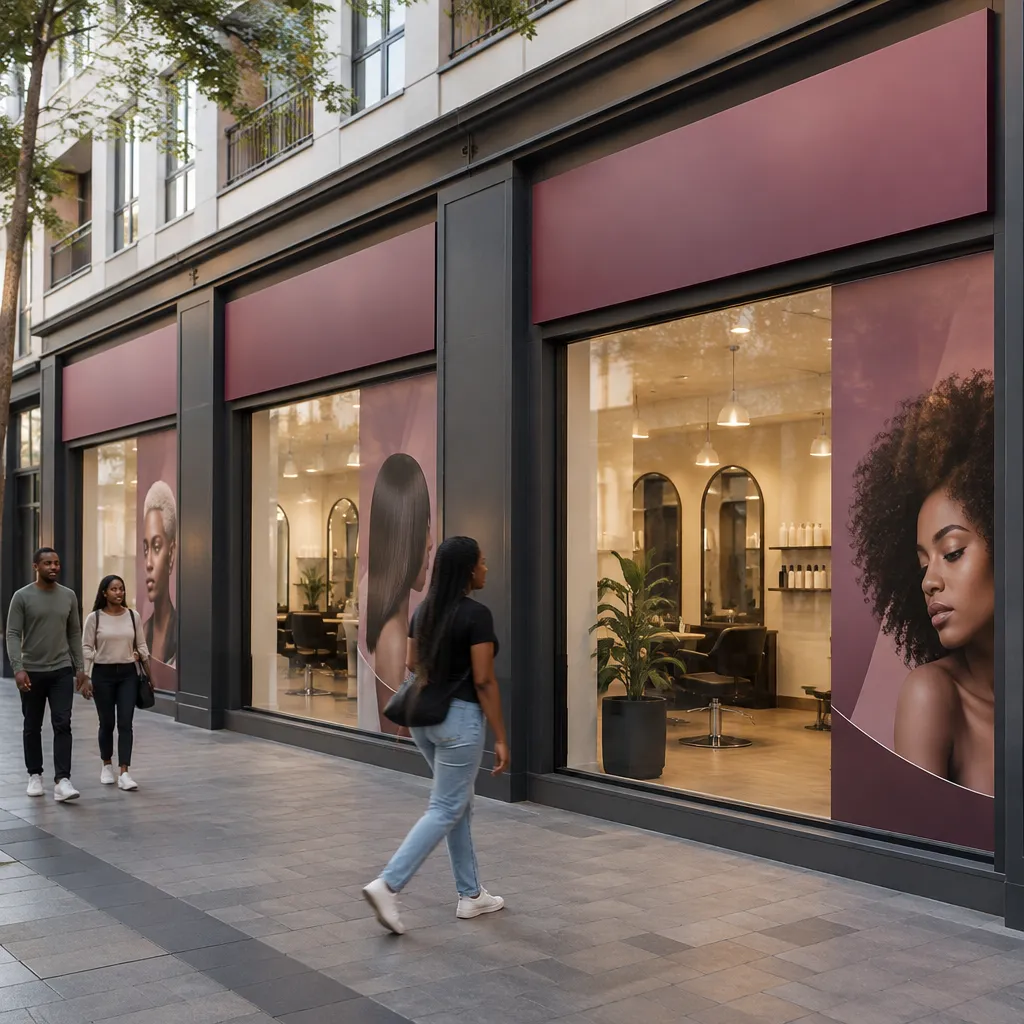
Brand Standards Before the First Sign Is Ordered
Write a one-page sign standard covering logo clear space, approved colours, typeface, the sign types permitted at each site and the placement of opening hours. Give it to the landlord, the shopfitter and the signage supplier at the same time. Most inconsistency happens when each party makes a reasonable choice in isolation.
Include a rule for what changes between sites. A flagship may take an illuminated fascia while a small suburban branch uses cut-out letters, but the logo, colours and service wording should remain identical.
Managing Rollouts Across Several Sites
Phase rollouts by site type rather than by date. Start with the flagship, where the brand is most visible, then roll the standard out to the rest. Keep a register of each site's approvals, fixings, installers and warranty dates. When a logo or service name changes, you need one list of every sign to update, not a search through old invoices.
Mobile beauty and wellness practitioners who travel to clients can carry the same identity onto a vehicle. Our vehicle branding service applies the approved standard to a fleet, so a home visit looks like part of the brand.
Pro tip: Photograph every installed sign from the street at the same time of day, and store the photographs with the site address. When a franchisee asks why their sign looks different, you can compare it with the approved version within minutes.
Frequently Asked Questions
What should a beauty salon sign say?
The sign should show the business name plus the service category in plain words, such as "Hair, Nails and Brows" placed beside the name. A client should understand what the business does from the pavement without reading a menu.
Is LED signage worth it for a salon in Gauteng?
It is worth considering for a salon with strong evening trade on a busy road, provided the electrical supply and approvals are in order. If either is uncertain, cut-out letters on a clean, well-lit fascia will often do the job for less risk.
Do I need municipal approval for a salon sign?
Often yes, particularly for illuminated, projecting or large signs. Requirements vary between municipalities, so check with the local council before ordering, and keep the approval paperwork with your lease documents.
Can window graphics block my treatment rooms from view?
They can, but they do not have to. Partial frosting or a band across the lower glass hides treatment beds while keeping the top of the window clear, so daylight and the reception desk remain visible from the street.
How do I keep signage consistent across several branches?
Use a single written sign standard, a short list of approved suppliers and a register of every installed sign. Share the standard with each landlord and installer at the start of every project, not after the first branch is already built.
Should I choose a printed menu board or a digital screen?
A printed board suits a small salon with a stable menu and a limited budget for updates. A digital screen makes sense when prices or promotions change often and someone can update the content centrally, without visiting the site each time.
Tell us which part of your salon or spa sign has brought in the most new clients, or which one you would redo first, because your experience is the most useful guide for the next owner planning a sign.
References
- Study on brand image, customer experience and purchase intention in the salon industry
- Southern African journal article on customer satisfaction and loyalty in small businesses
- Study on customer experience, satisfaction and loyalty at South African hair salons and spas
- Journal article on brand experience, satisfaction, trust and loyalty in beauty spa settings